Selected work
 Craft cannabis retail
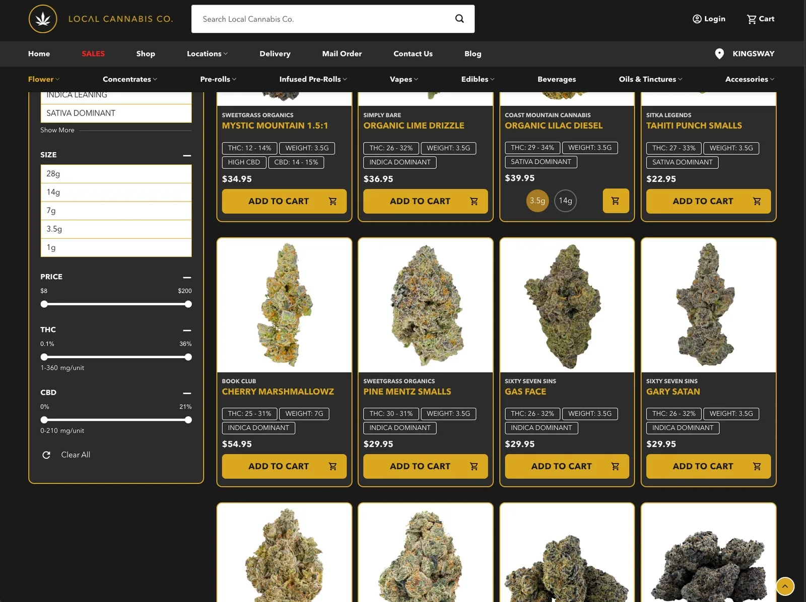
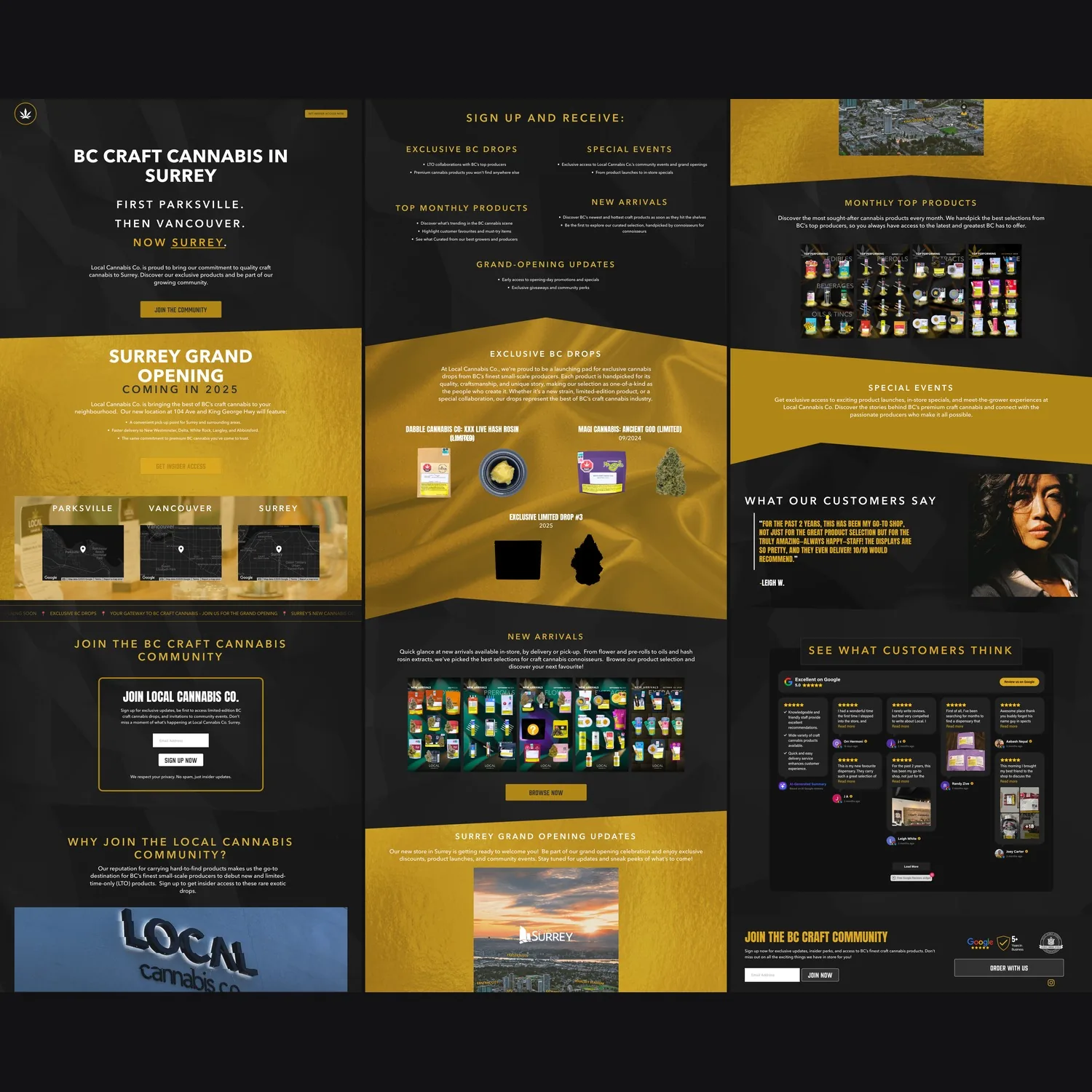
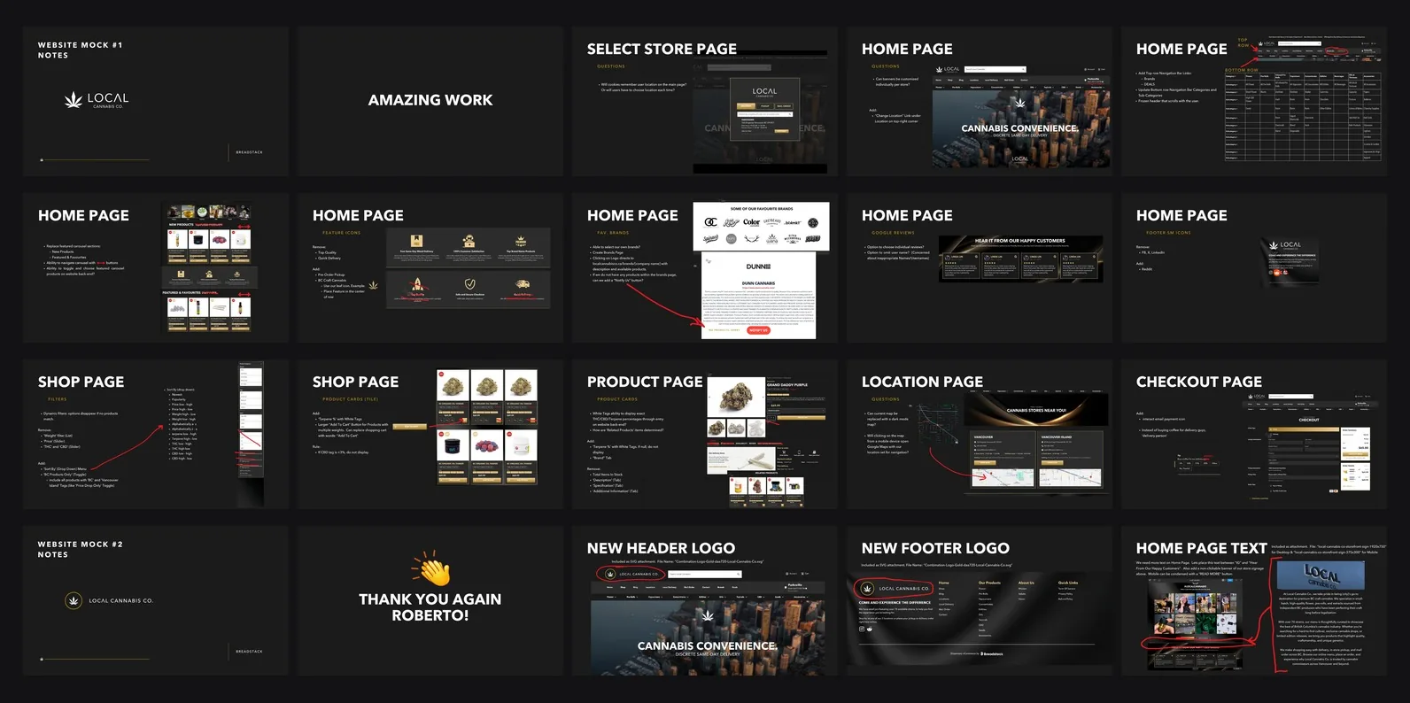
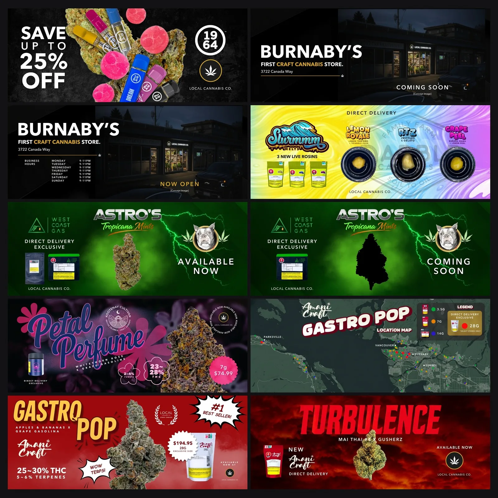
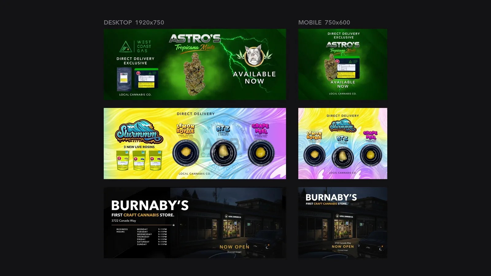
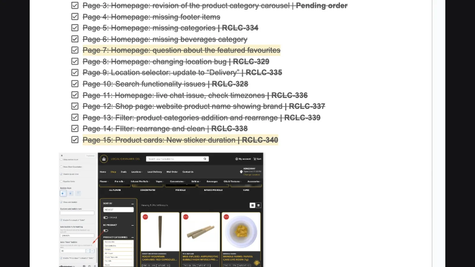
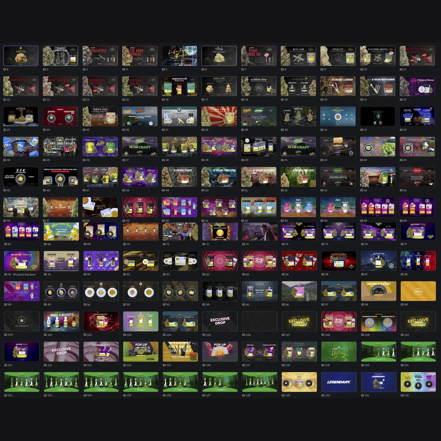
The whole marketing function for a BC craft cannabis retailer: brand, website, search, email, paid ads, social, retail, packaging and events. 57 pieces, grouped by discipline.
The brand system
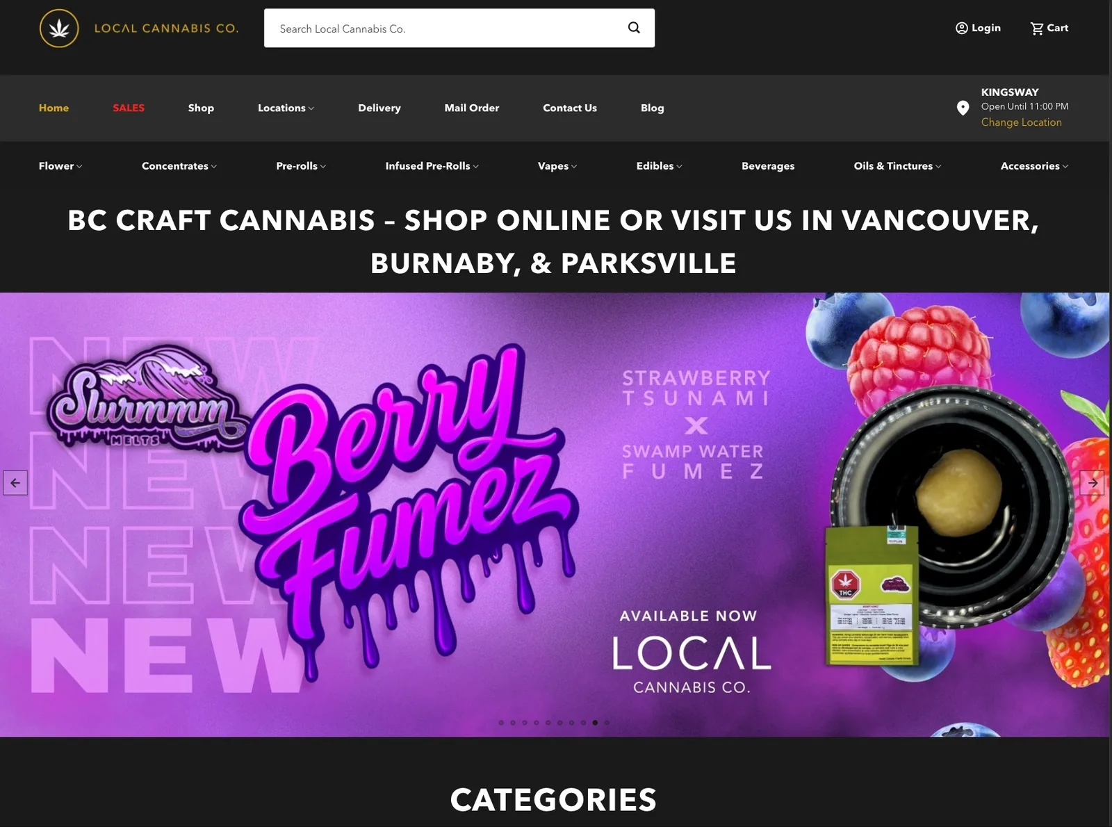
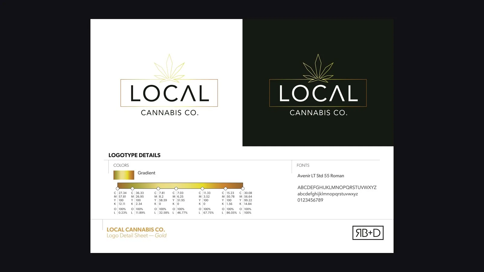
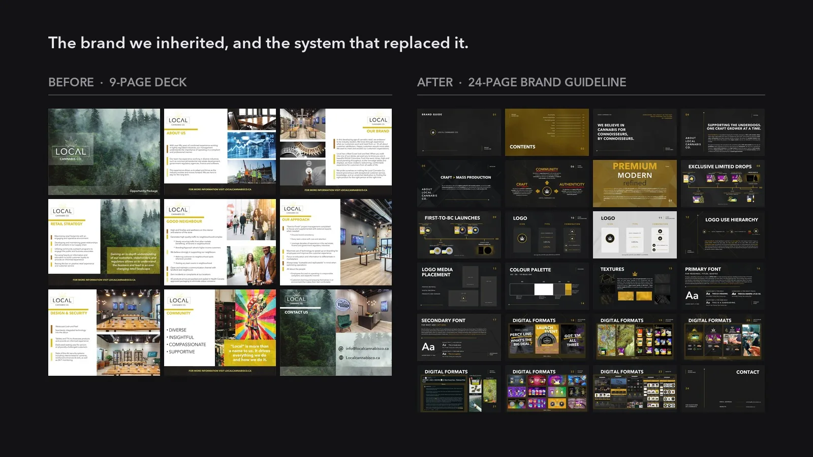
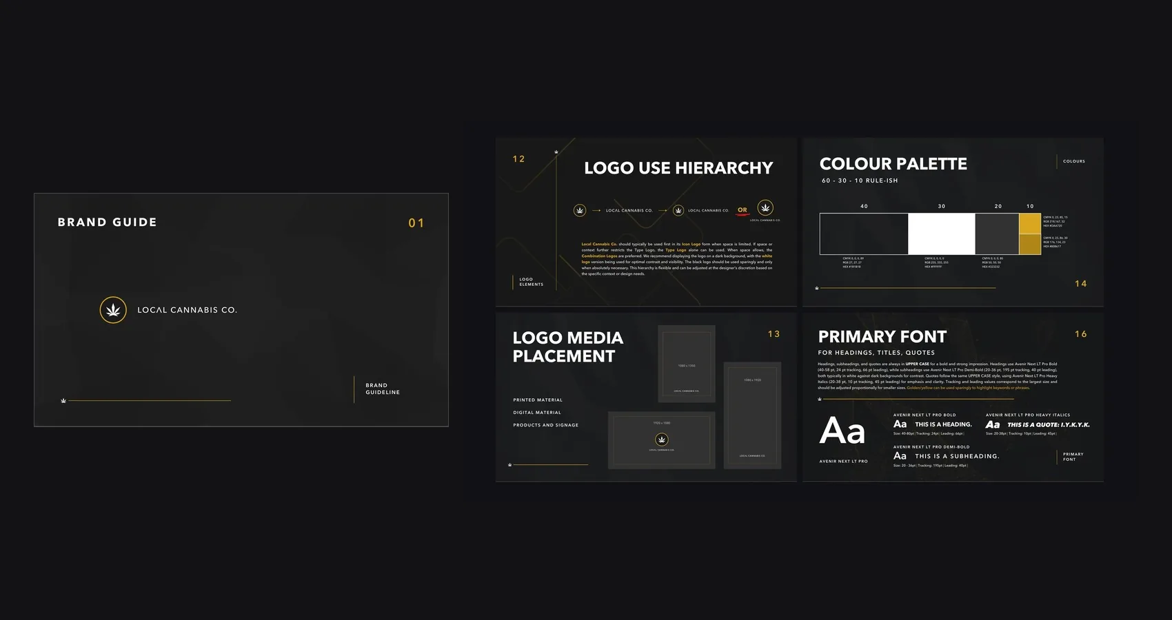
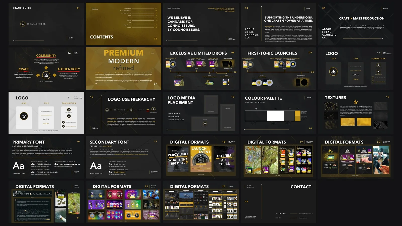
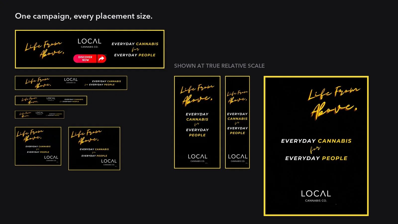
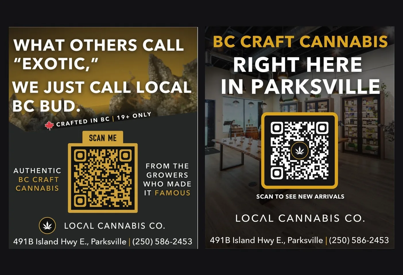
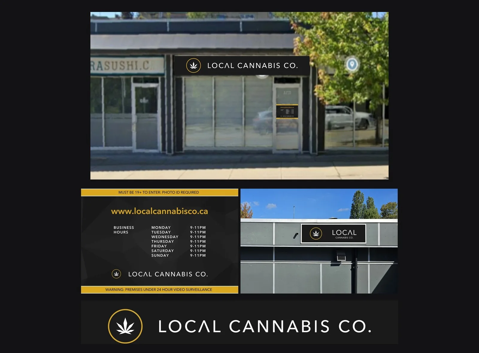
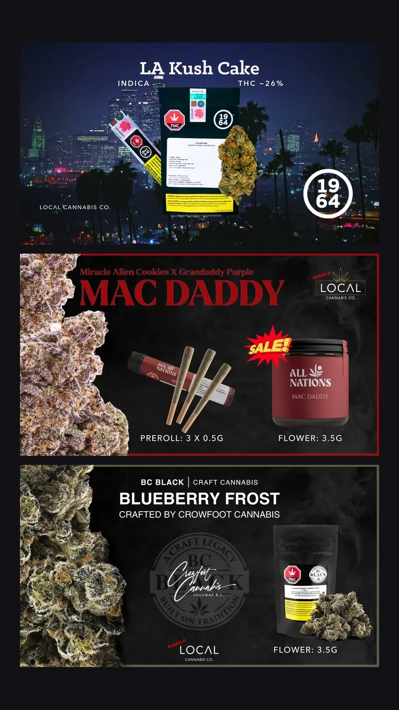
Gold on black, held without drift. The system was built to make a craft cannabis retailer read as premium in a category that mostly reads as clinical or as a head shop, and it does it with almost nothing: two darks, white, and one gold that is only ever a tenth of the frame. Type is a single family in upper case. The written guideline runs to twenty-four pages and specifies tracking and leading in points, which is why the same three colours and one face survived a website, a hundred product listings, packaging, in-store print, email, paid social and events without drifting.
Palette
- Near-black #1B1B1B 40% of the frame. The dominant ground. RGB 27, 27, 27. Also the logo colour on light backgrounds.
- White #FFFFFF 30%. Type, and the light ground. RGB 255, 255, 255.
- Charcoal #323232 20%. The second dark, one step up from the ground, for panels and texture. RGB 50, 50, 50.
- Gold #DAA720 10%, and never more. The brand, on dark grounds. RGB 218, 167, 32.
- Deep gold #B08617 The same 10% on LIGHT grounds, where the brighter gold loses contrast. RGB 176, 134, 23.
Typography
- Avenir Next LT Pro Bold Headings. Always upper case. 40-80pt, 24pt tracking, 66pt leading, white on dark.
- Avenir Next LT Pro Demi-Bold Subheadings, also upper case, and the widest tracking in the system by a distance: 20-36pt at 195pt tracking, 40pt leading.
- Avenir Next LT Pro Heavy Italic Quotes only. Upper case, 20-38pt, 10pt tracking, 45pt leading. The one italic in the system.
- Avenir Next LT Pro Medium Body and captions, and the only place the system drops out of upper case. Body 14-18pt / 24pt leading; captions 10-15pt / 20pt leading, set in gold.
- Heading 40-80pt · tracking 24 · leading 66 · UPPER CASE
- Subheading 20-36pt · tracking 195 · leading 40 · UPPER CASE
- Quote 20-38pt · tracking 10 · leading 45 · UPPER CASE italic
- Body 14-18pt · tracking 0 · leading 24 · sentence case
- Caption 10-15pt · tracking 0 · leading 20 · sentence case, gold
- Colour split 40 near-black · 30 white · 20 charcoal · 10 gold
Guidelines
Do
- Hold the 40 / 30 / 20 / 10 split. The gold is a tenth of the frame, and that restraint is the whole reason it reads as premium.
- Swap the gold by ground: #DAA720 on dark, #B08617 on light. They are the same brand colour solved twice.
- Set every heading, subheading and quote in upper case. Sentence case exists only for body and captions.
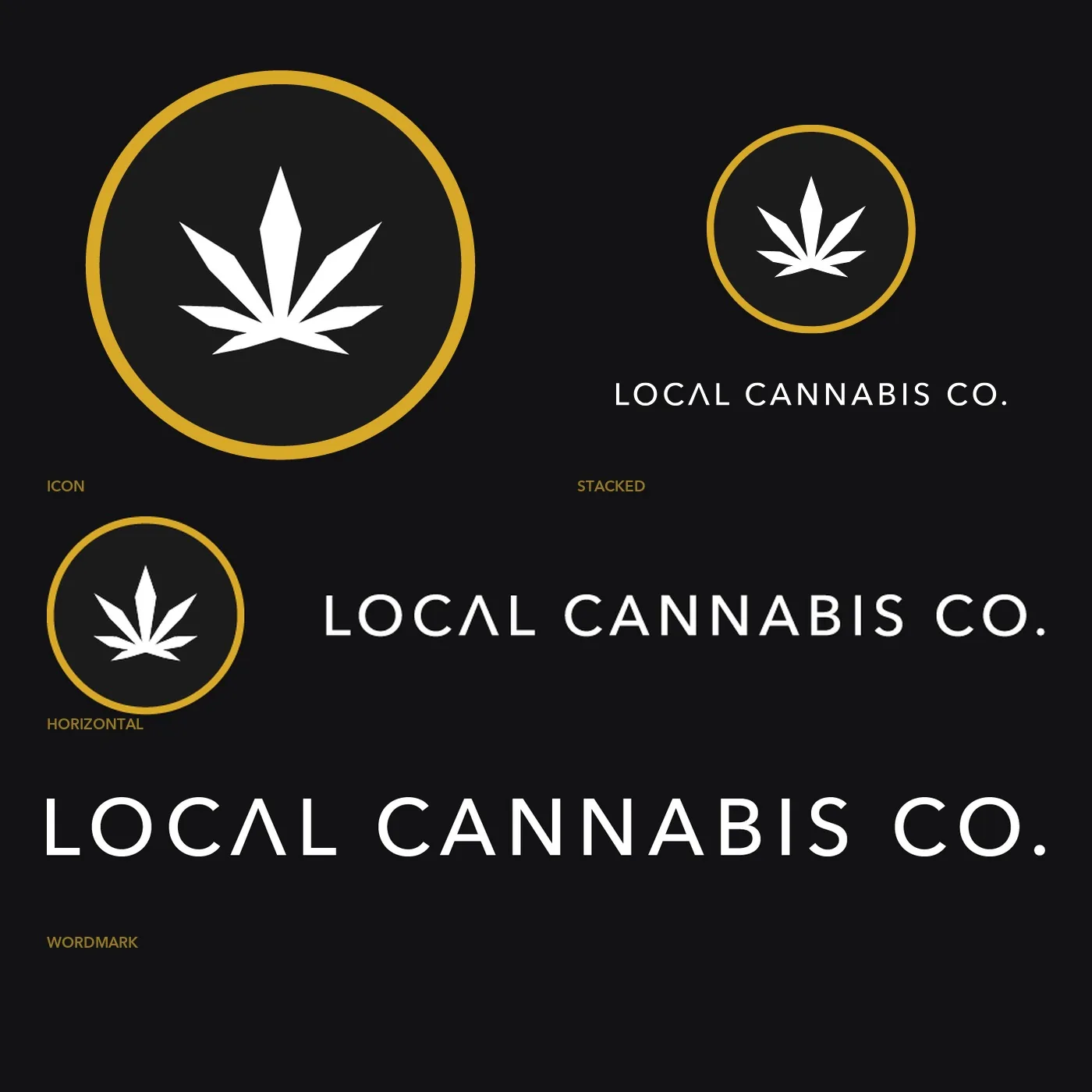
- Reach for the logo in this order: icon when space is tight, type when it is tighter, the combination whenever space allows.
- Fill empty background with dark and gold geometry, angular facets and crisp polygons, at 25-70% opacity so the headline and the product still lead.
- Place the mark centred, or bottom centre. Build to 1080x1350, 1080x1920 and 1920x1080.
Don’t
- Never let the gold take a large surface. Ten percent is the specification, not a suggestion.
- No second typeface. One family in five weights is the entire system, and it is what kept every piece of material consistent.
- The black logo is used sparingly and only when absolutely necessary. Dark ground with the white logo is the recommended lockup.
- Never run a texture at full opacity. Above about 70% it starts competing with the thing it is behind.
- No casual or lifestyle-snapshot imagery. The direction is premium and clean, shot in natural or soft warm light.
- No sentence-case heading. It reads as a different brand immediately.
Brand & identity
Website
SEO & AI Search
Paid ads
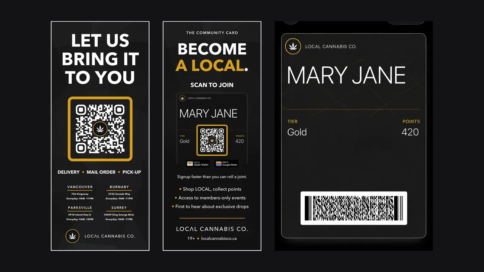
Retail & in-store
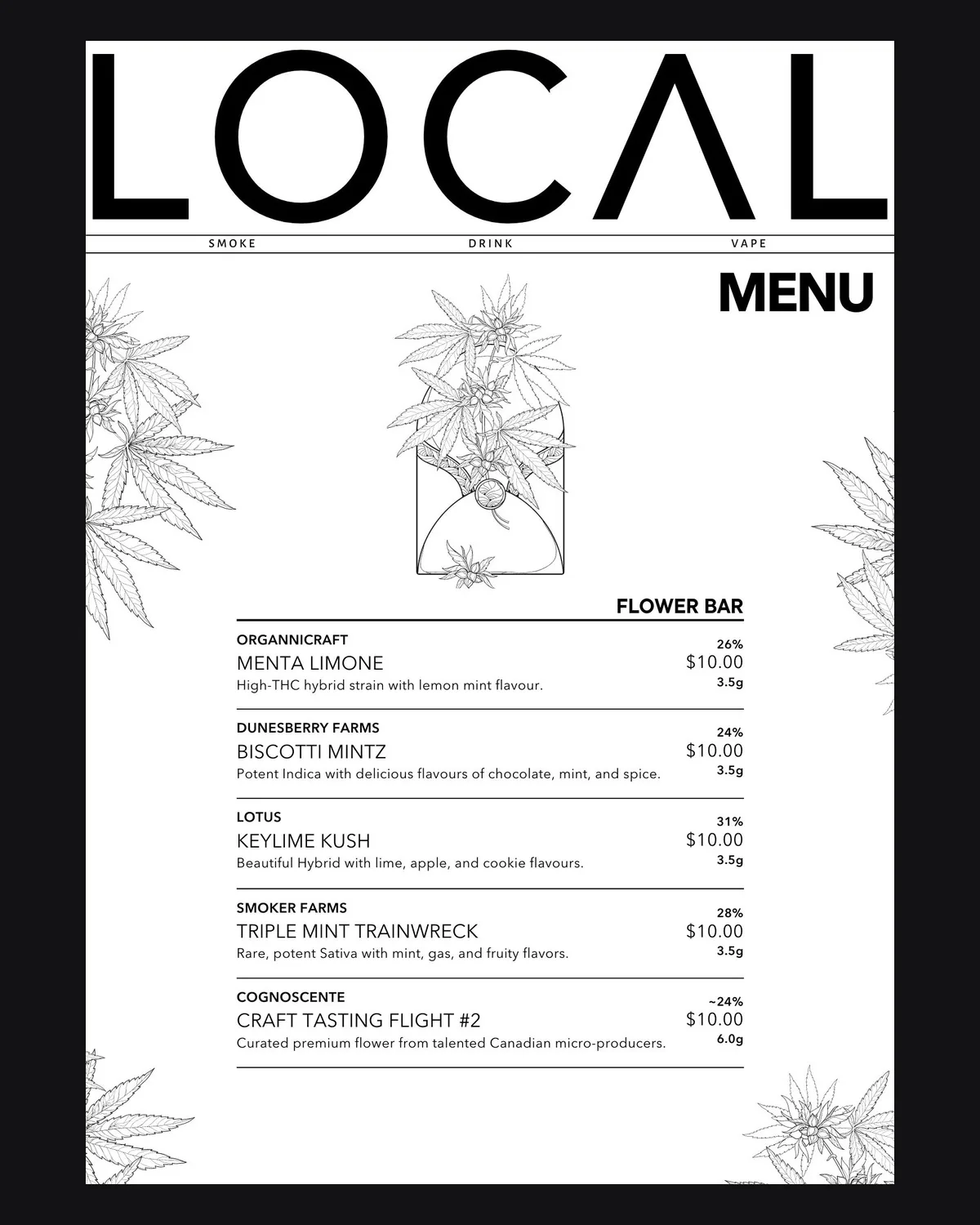
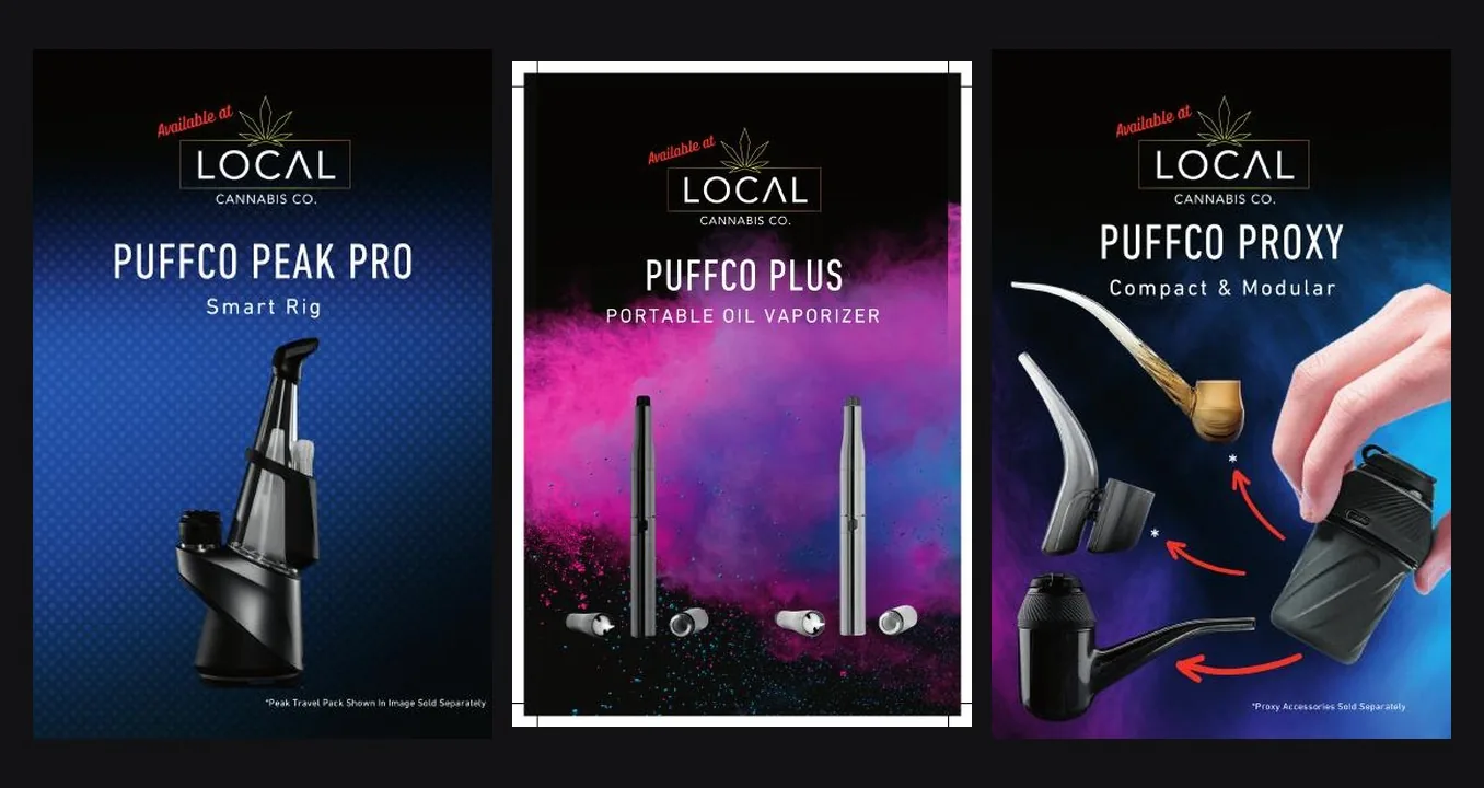
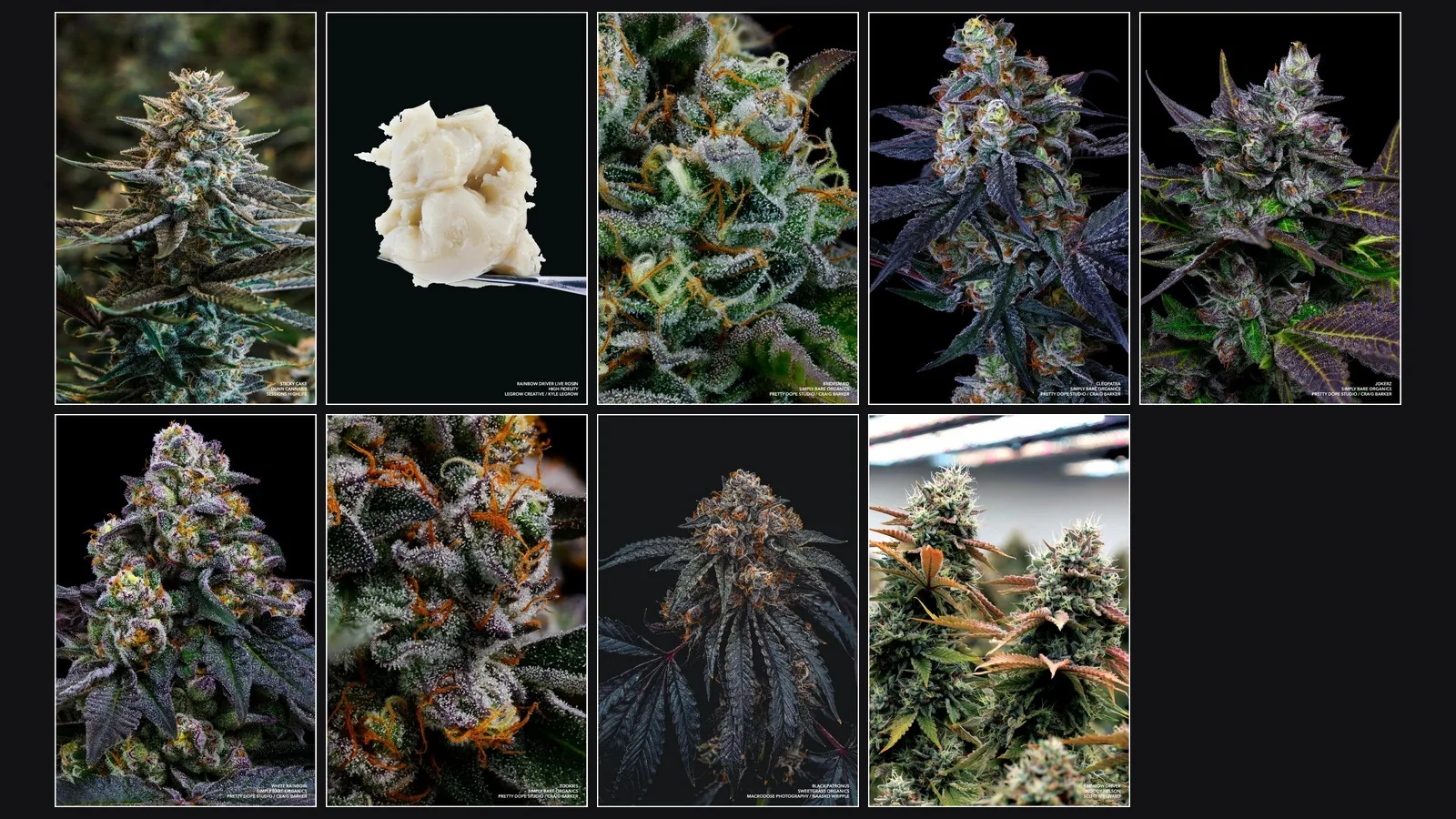
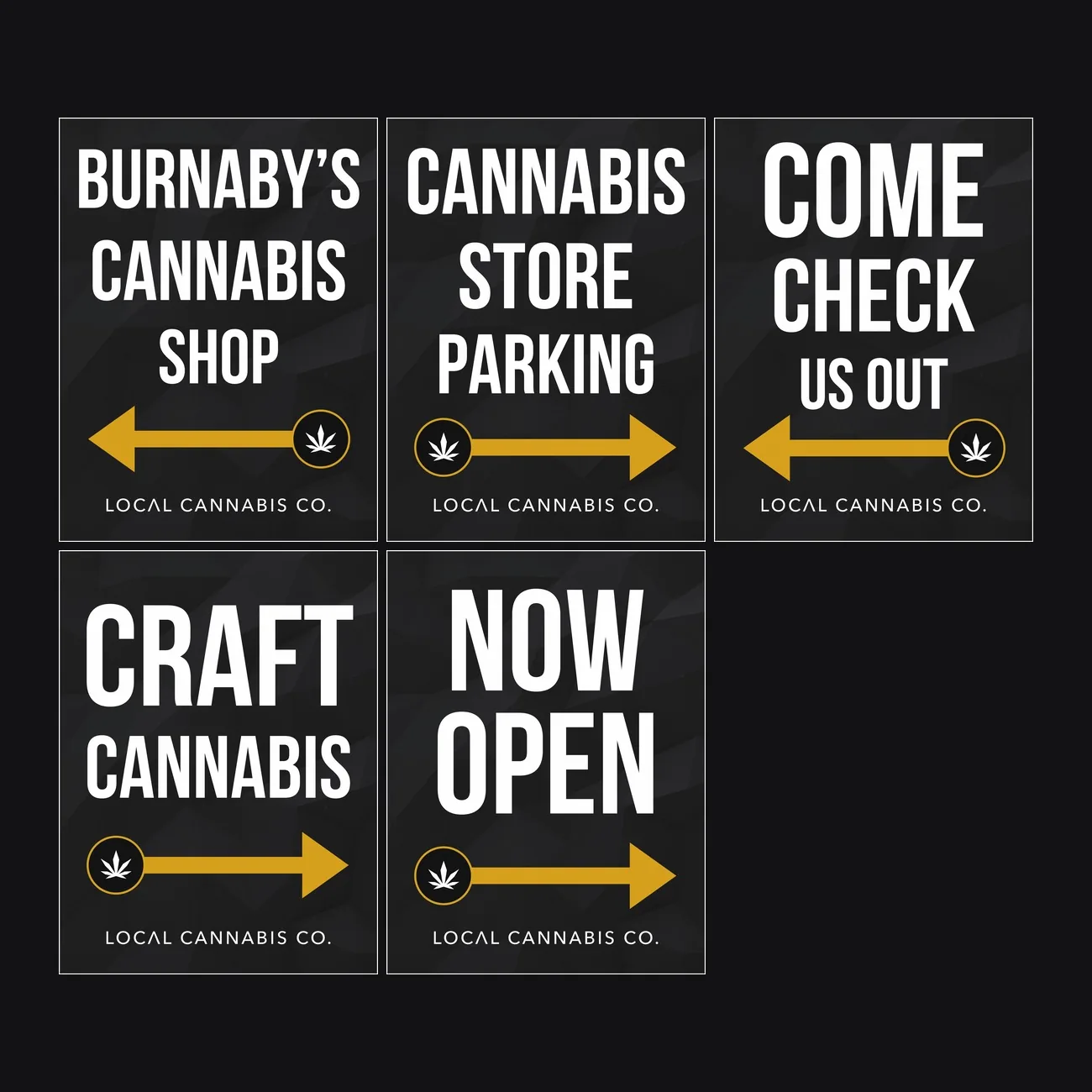
Print, packaging & product
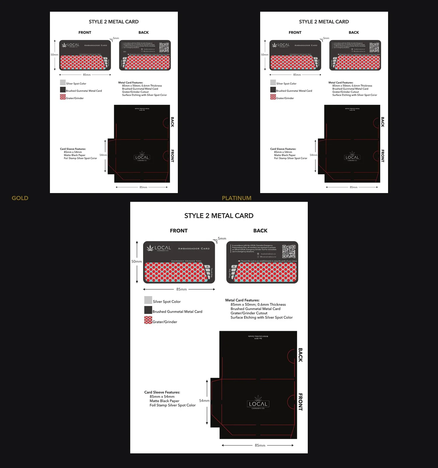
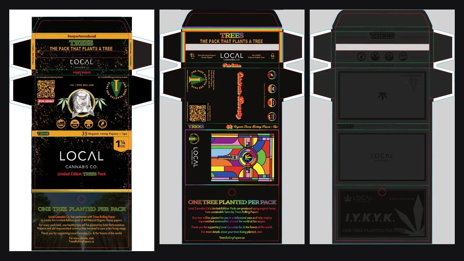
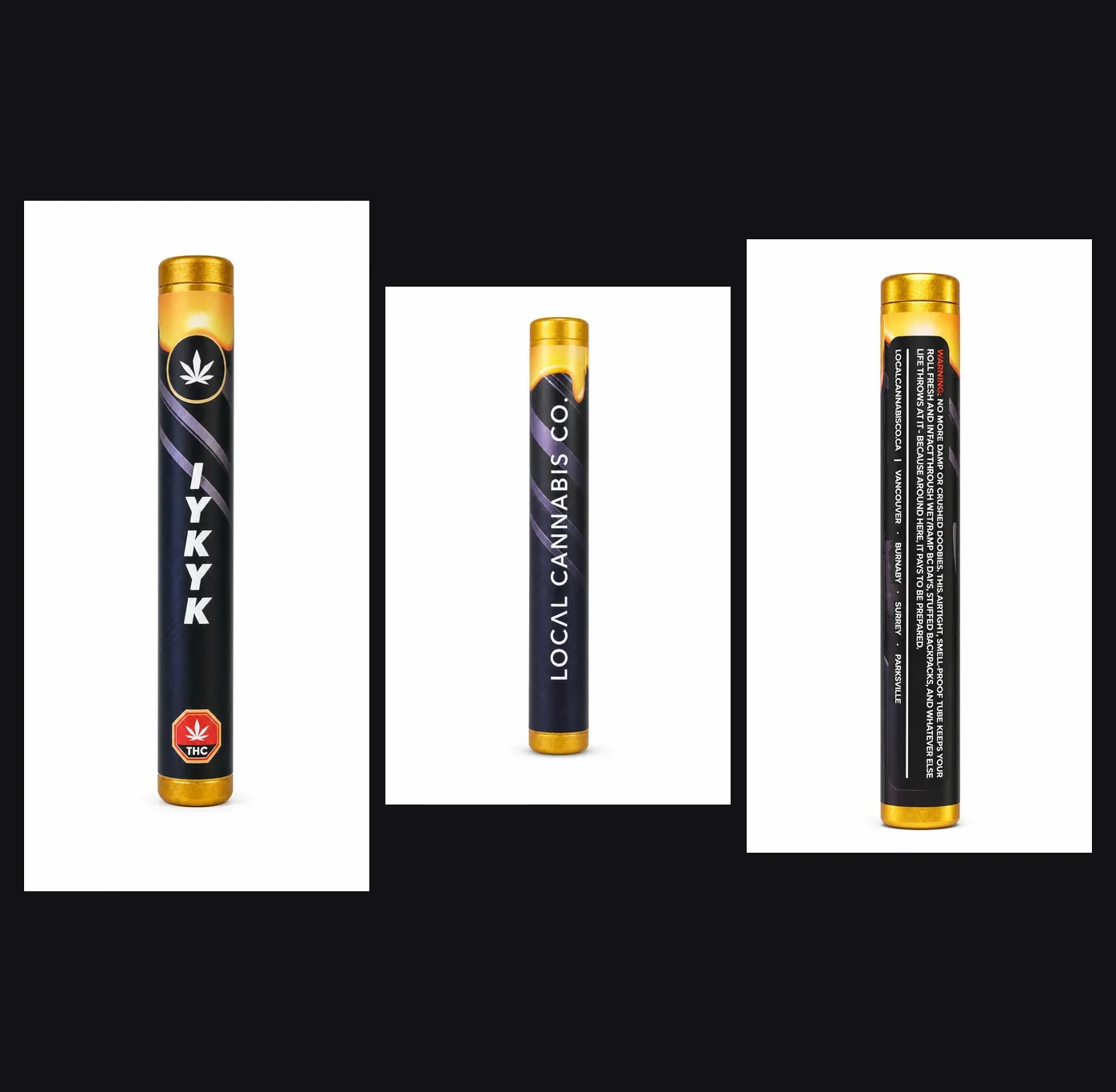
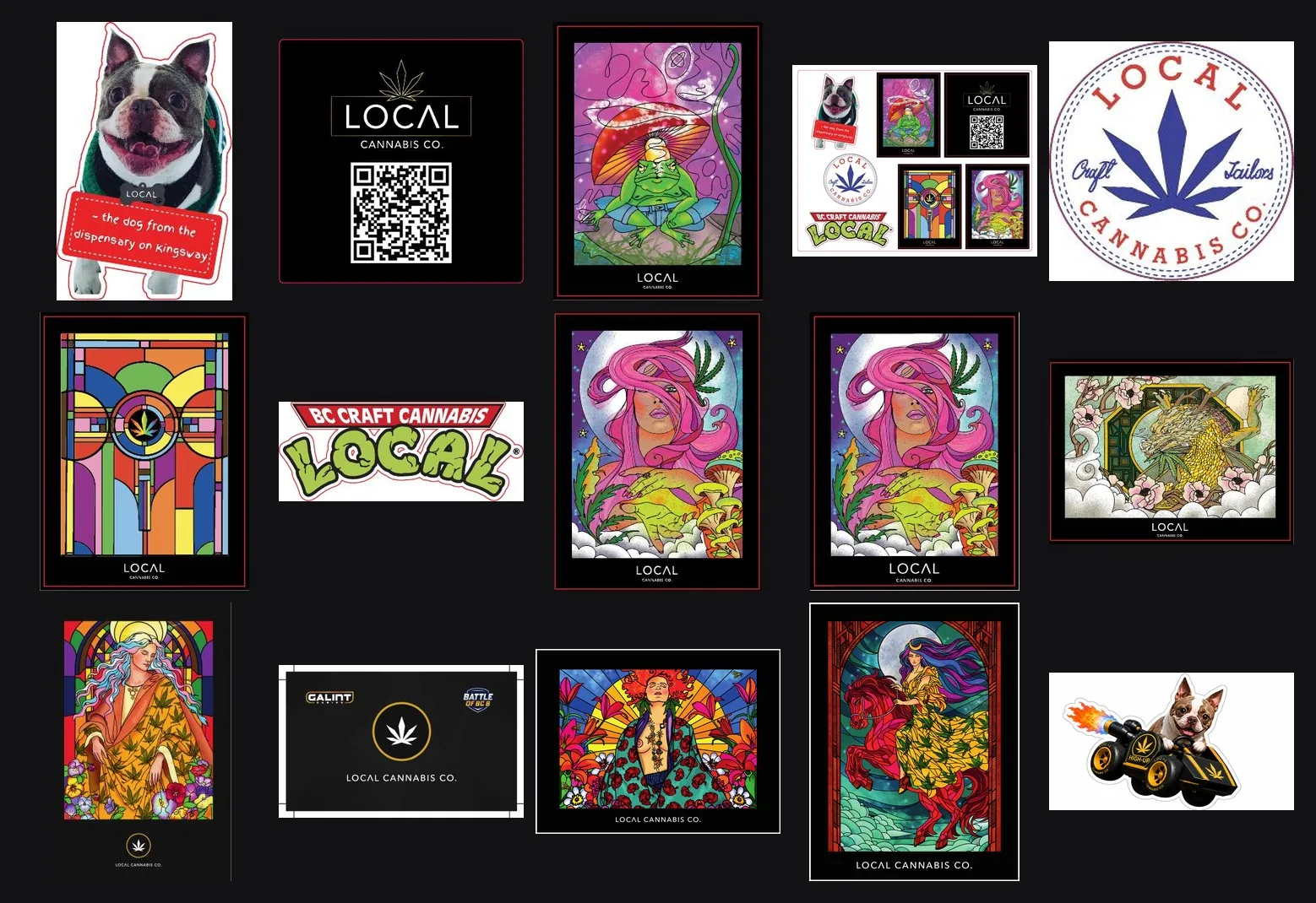
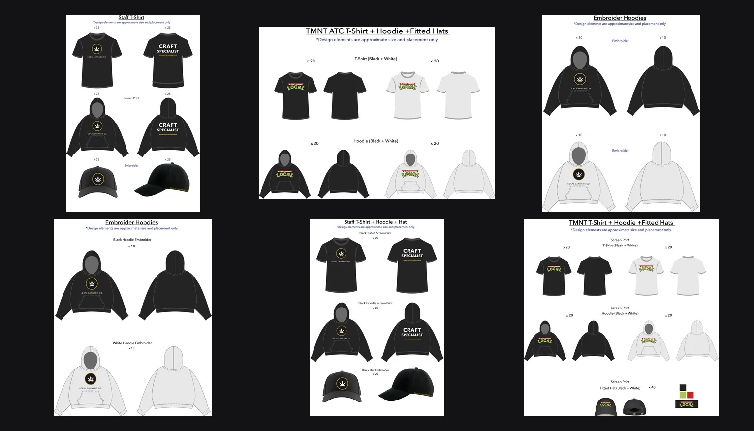
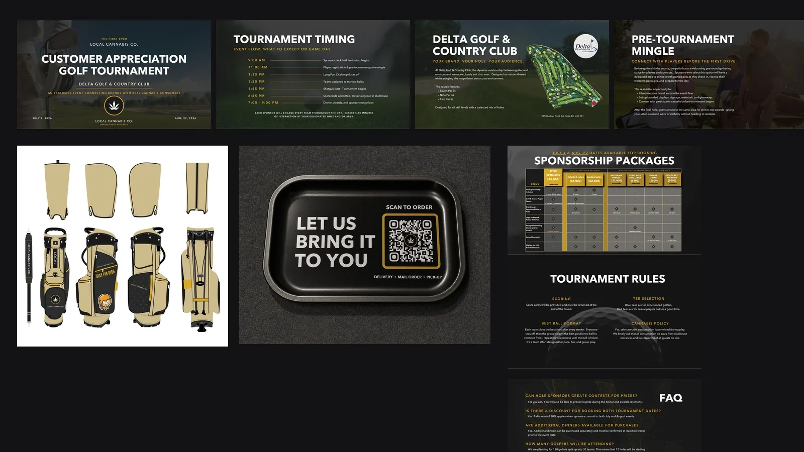
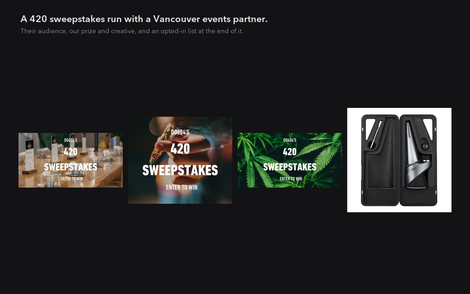
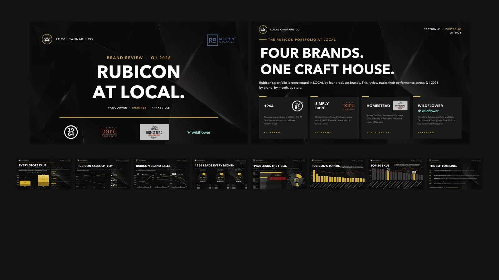
Events & partnerships

What it added up to
Design and content are the visible part. This is the part the owner checks. Figures come from the client’s own Google Business Profile reporting. The headline numbers compare January to September 2022 against the same nine months of 2023, so the two windows match.
+133%
more Google searches brought up the business
year over year
+148%
more people viewed the store profiles
year over year
+65%
more calls, direction requests and website clicks
year over year
88%
of those searches came from people who never typed the brand name into Google
discovery, not brand
Local search, store by store
Full calendar years, Vancouver and Parksville
The clearest single result. The Vancouver store opened in February 2022 with almost nobody finding it on Google. By December of that same year it was being found roughly 37x as often.
The three store rows are the most recent reporting and all sit on the same five months, so they can be read against each other. The stat wall above them is the earlier year-over-year comparison, which is stated separately because Google changed how it counts profile activity in 2024 and the two eras are not the same measure.
The calendar-year rows are the long view. Vancouver and Parksville have twelve complete months in every year shown, so they can be read year against year. Burnaby is the newest store and has no earlier year to compare against, which is why it appears in the five-month window above and not in the calendar-year rows. Only contact actions are compared across the longer span. Profile views are left out of it on purpose: Google redefined how it counts them in 2024, so a 2023 view and a 2025 view are not the same thing, while a phone call is still a phone call.
Growth shown as percentages. Visibility and contact metrics only: revenue, cost and absolute customer counts stay with the client.
Found by strangers, not just regulars
Organic search
Google Search Console, measured on the domain rather than the site build, so a rebuild does not reset the history. January against May 2026.
The number that matters is the last one. Anyone can rank for their own name. Clicks from people who were not searching the brand grew 70%, and the brand’s share of its own top queries fell from 84% to 73%, which is what it looks like when search starts bringing in strangers instead of regulars.
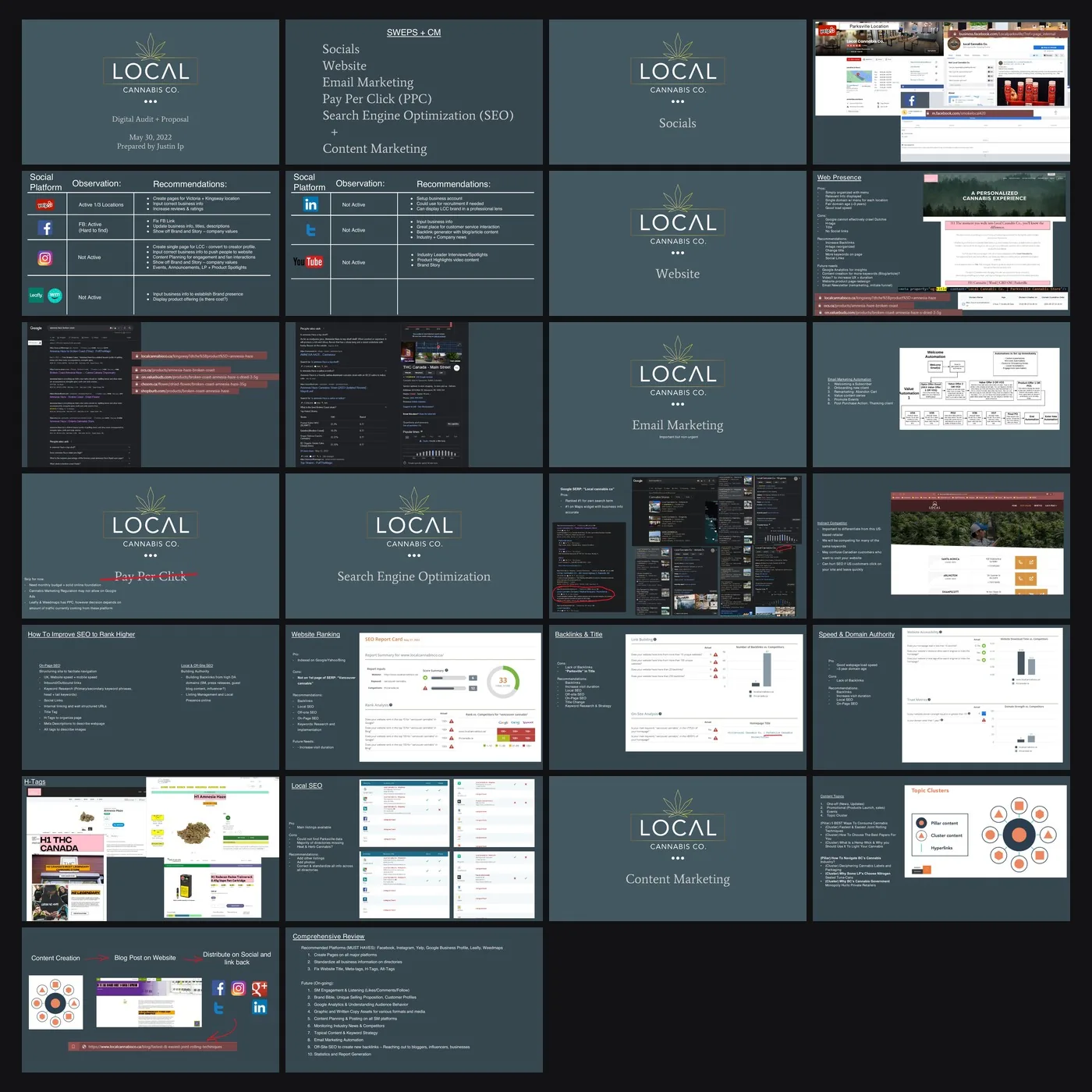
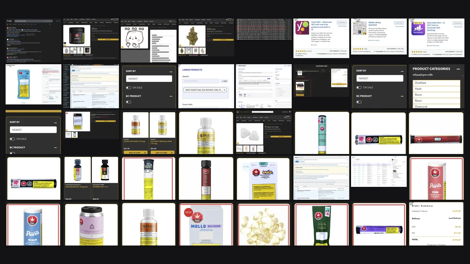
The brand arrived late to a crowded category. Established competitors already held the obvious searches, and going straight at them with the main site would have meant years of losing to sites with a head start. The plan inverted the usual order: optimise the product pages first, before the site as a whole, and compete on the specific product searches nobody else had bothered to claim. Those queries convert harder because someone naming a product is already close to buying it, and they were winnable. The target was the top five. By April, 48 of the 50 tracked queries sat on the first page and the average position across them was 10.7, so the first-page goal was met broadly while the top-five target was not.
Website analytics figures are deliberately left off this page: that property was installed part-way through January 2026, so any growth figure drawn from it would measure the install date rather than the work.
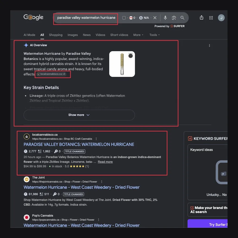
Named by the answer engines
AI search
A scheduled monthly run of fifteen priority questions across the AI answer engines, scored on whether the brand is named in the answer and which page the engine read to get there. June 2026 baseline, with ChatGPT and Gemini captured directly in August.
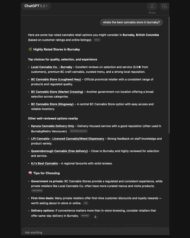
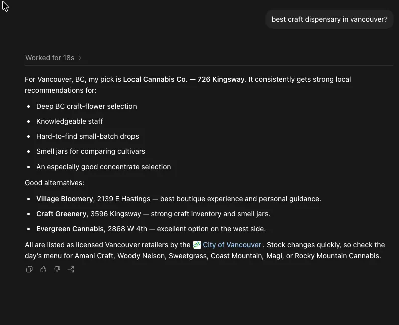
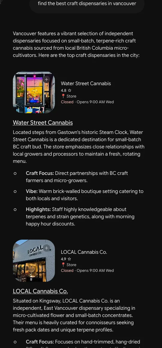
All three name it, and one of the three puts it first. Asked for the best craft dispensary in Vancouver, ChatGPT answers with the brand outright, ahead of three alternatives it also names. Perplexity recommends it as a top pick for craft cannabis in BC and cites the client’s own site to get there. Gemini lists it among the city’s top craft dispensaries, second of its set rather than first, which is said that way here and shown that way in the screenshot above.
The questions it lost are in the report too. Delivery, mail order and product lookups returned competitors and grey-market sites, and the education questions were owned by American blogs. That list of misses is the content plan for the following month.
The June run also established that Google was withholding AI Overviews from cannabis queries entirely, across all fifteen. Knowing a channel is closed is worth as much as a ranking in one that is open. That is the same month ChatGPT could not be scored at all, because the unattended run met a login wall. Both are recorded as misses rather than quietly dropped, and the August captures are what closed the ChatGPT gap.
Answer engines are sampled, not guaranteed: results move month to month, which is the reason for tracking them monthly.
Reach that got sharper every month
Paid social
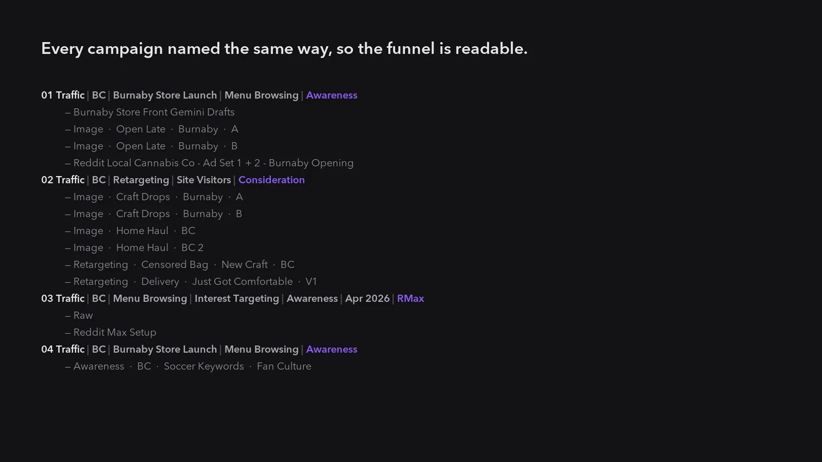
Reddit advertising, rebuilt around what the reporting kept saying. Every community the campaign ran in was scored monthly on click-through, and the budget moved toward the ones that earned it. January to April 2026.
The mass-interest communities looked like the win and were not. One general-interest community absorbed the largest share of impressions in the opening month and returned the weakest click-through on the board. The small BC communities beside it, a fraction of the size, pulled better than twice its rate. Four months of that pattern is not noise, and the buying changed to match it.
By April the five strongest communities in the campaign were all local, and the reach behind them had grown nine-fold since January.
Figures cover the top communities reported each month. Click-through rates and ratios only: budgets and cost figures stay with the client.
A second map channel, properly managed and measured
Apple Maps
The same three stores on Apple Business Connect, over the same five months. A second map platform, set up, corrected and reported on rather than left unmanaged.
Two of the three grew, and the flagship did not. The Kingsway store slipped over this window on Apple while it rose on Google. That is in the report rather than out of it: a channel that only ever produces good news is not being measured, it is being decorated.
The category-versus-brand split is the useful part. Three in four people who reached the stores through Apple were searching for a kind of shop, not a name they already knew, which is the definition of a listing doing acquisition rather than just catching people who were already looking.
Apple Business Connect reporting, January against May 2026.
Removed by Instagram, and back bigger
Social
In February the account was taken down and every follower went with it. Meta removes cannabis retail accounts routinely, so this was enforcement rather than an accident, and it is the hardest thing that happened to any channel here.
Rebuilt from zero, and past where it started. Five months after the takedown the account was reaching three times as many people per month as it did in its last full month before it, on roughly a third of the followers. Against the previous full year’s monthly average it was reaching close to six times as many.
The reach also changed character. Before the takedown, most of it came from people already following. After the rebuild, two thirds came from people who were not, which is the difference between an audience being reminded and an audience being found.
An audience built up post by post over years can be gone inside a day, and on this platform that risk never goes away. What made the difference is that the strategy did not change. It had worked to build the account the first time, so it was run again exactly as it was, and it rebuilt the presence in a fraction of the time the original took. A strategy is only proven when it has to work twice.
Instagram account reporting. Follower counts, reach and impressions only.
Print that could be counted
Print and offline
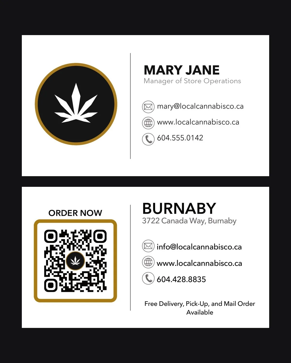
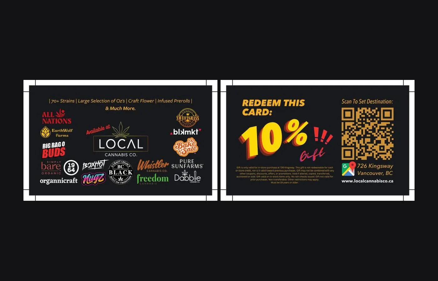
Every offline piece went out with its own tracked code: bag flyers, business cards, rolling trays, in-store signage, direct mail, and the ferry-terminal map campaigns. Scans were logged per piece, per day, with location.
Most print is spent on faith. A flyer goes out, sales move or they do not, and nobody can say which piece did the work. Here every piece had its own code, so a placement could be judged on its own and the weak ones stopped.
The scan volumes are modest next to the digital channels, and are shown that way rather than inflated. The point is not the size of the numbers, it is that the numbers exist at all: one placement produced two thirds of its link’s entire year inside a single month, which is only visible because it was being counted.
Link and QR scan reporting, 2023 through 2026.
Selling with nobody at the desk
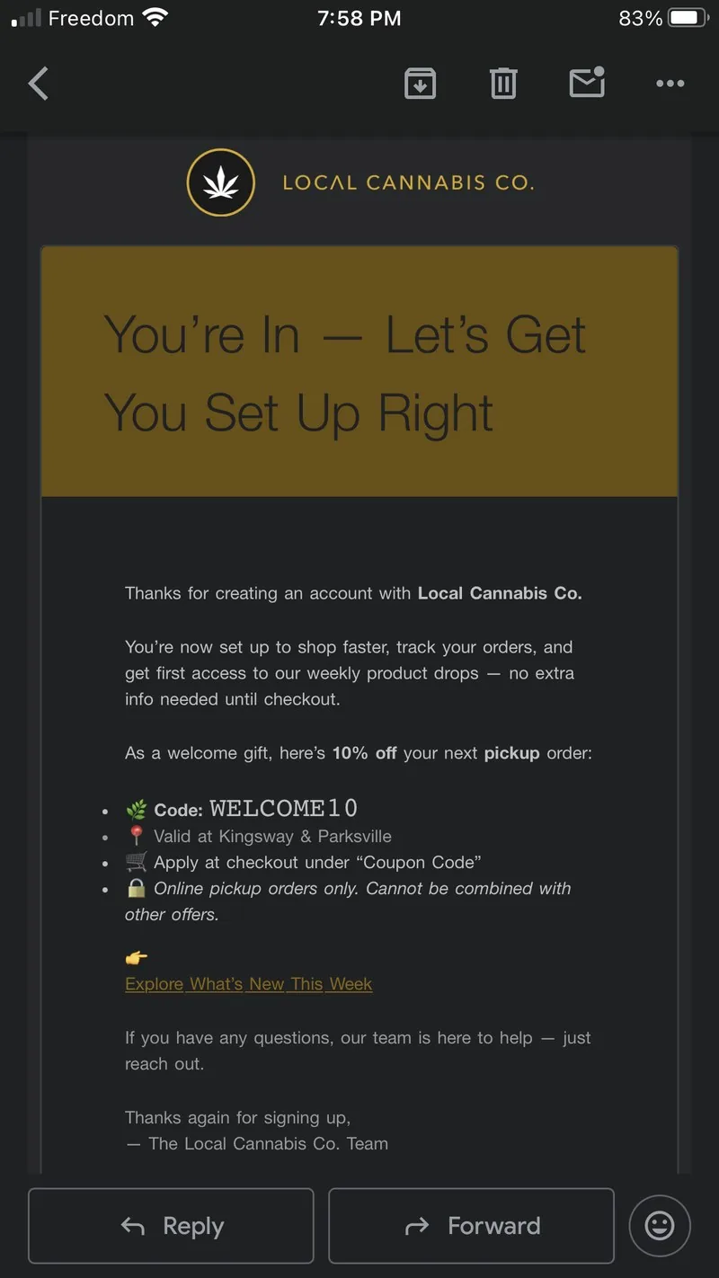
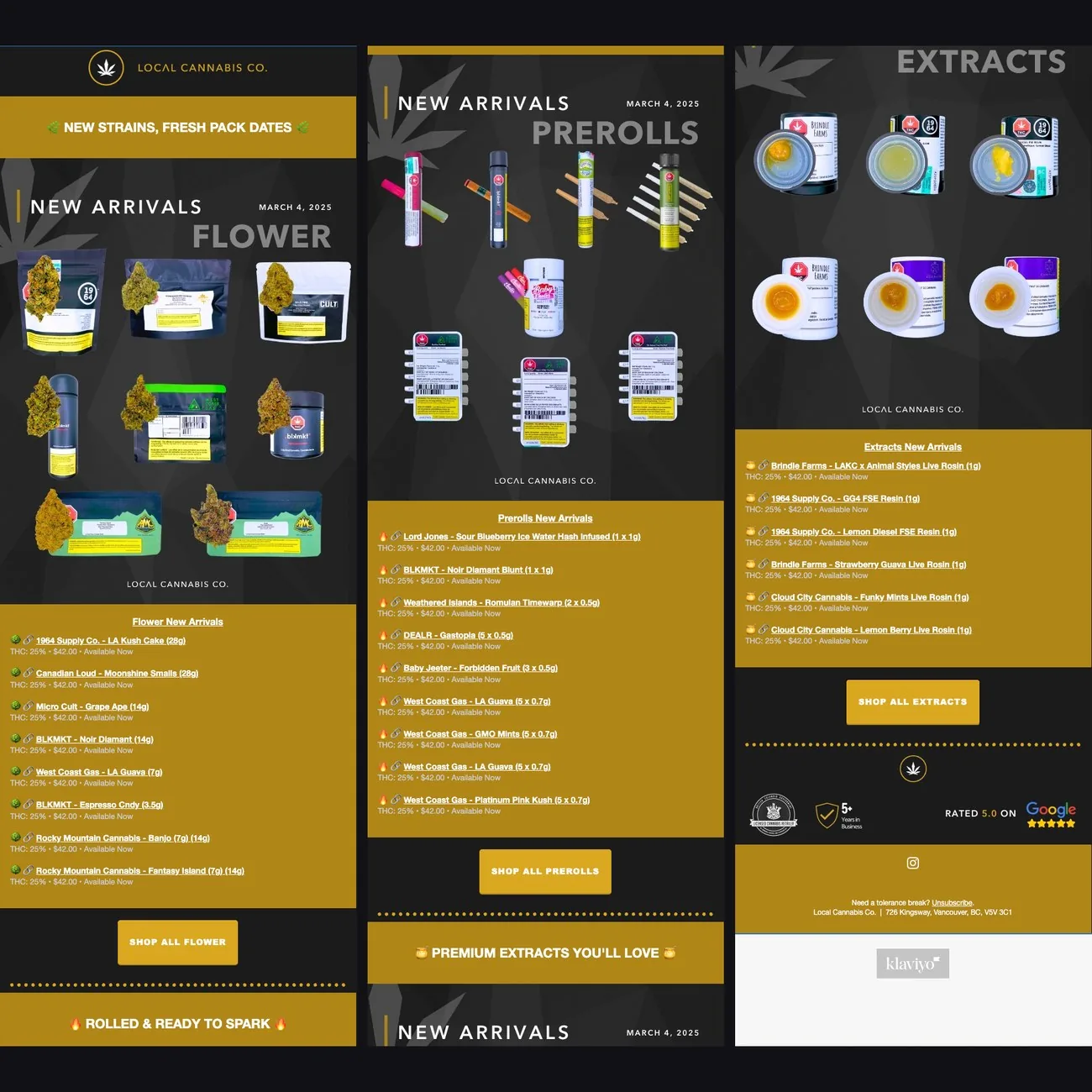
Lifecycle automation
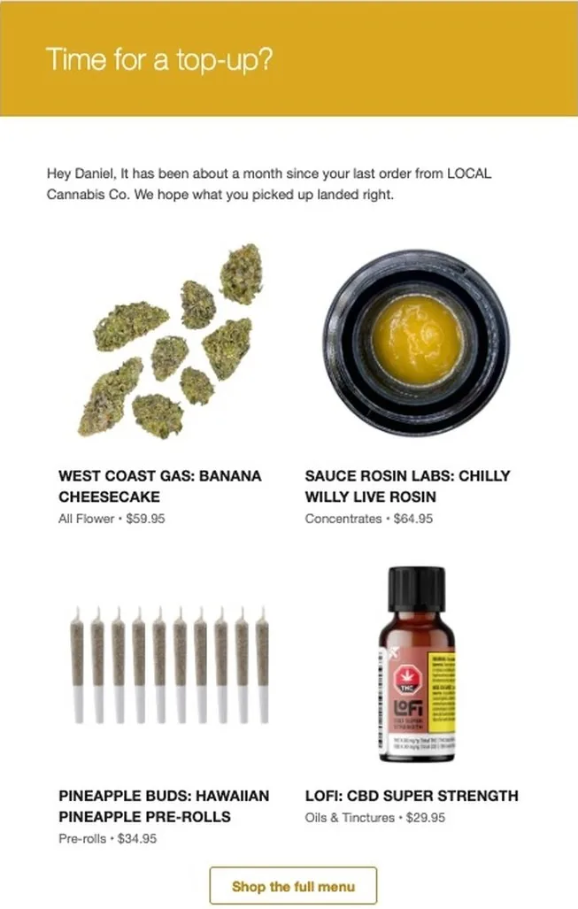
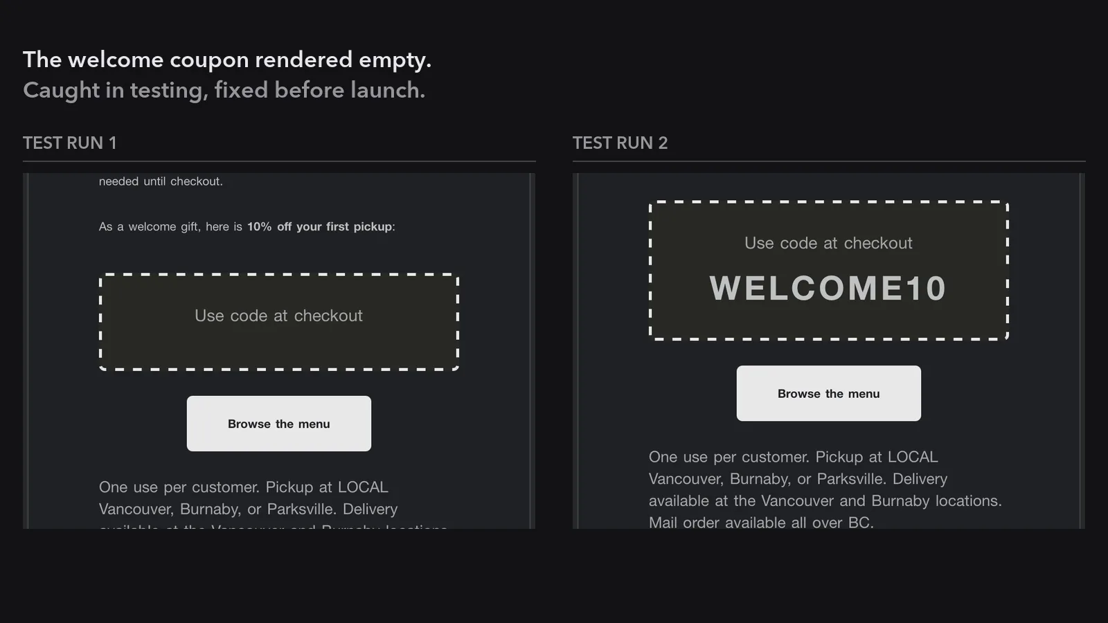
Eleven automated flows on the online store, covering cart recovery, welcome, review requests and replenishment. Built in-house, measured weekly, and reported per flow rather than as one lump. January to May 2026.
Timing beat copy, decisively. The same abandoned cart, chased one hour later, converted at 11.9%. Chased the next day instead, 4.1%. Nothing about the message changed. That single finding is the argument for measuring flows separately rather than reporting an email programme as one number.
Overall conversion across every flow ran at 7.4% against a category benchmark of five to eight, and the weakest flow was identified and named in the same report rather than buried in the average.
Cart recovery alone brought back thousands of dollars of orders the business would otherwise have lost, from three flows that ran without anyone touching them.
Conversion rates and run counts only: order values and revenue attribution stay with the client.
Social