← All work
Design and build
Lumen & Trim
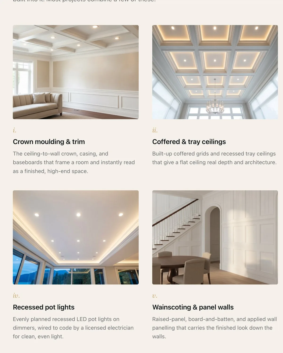
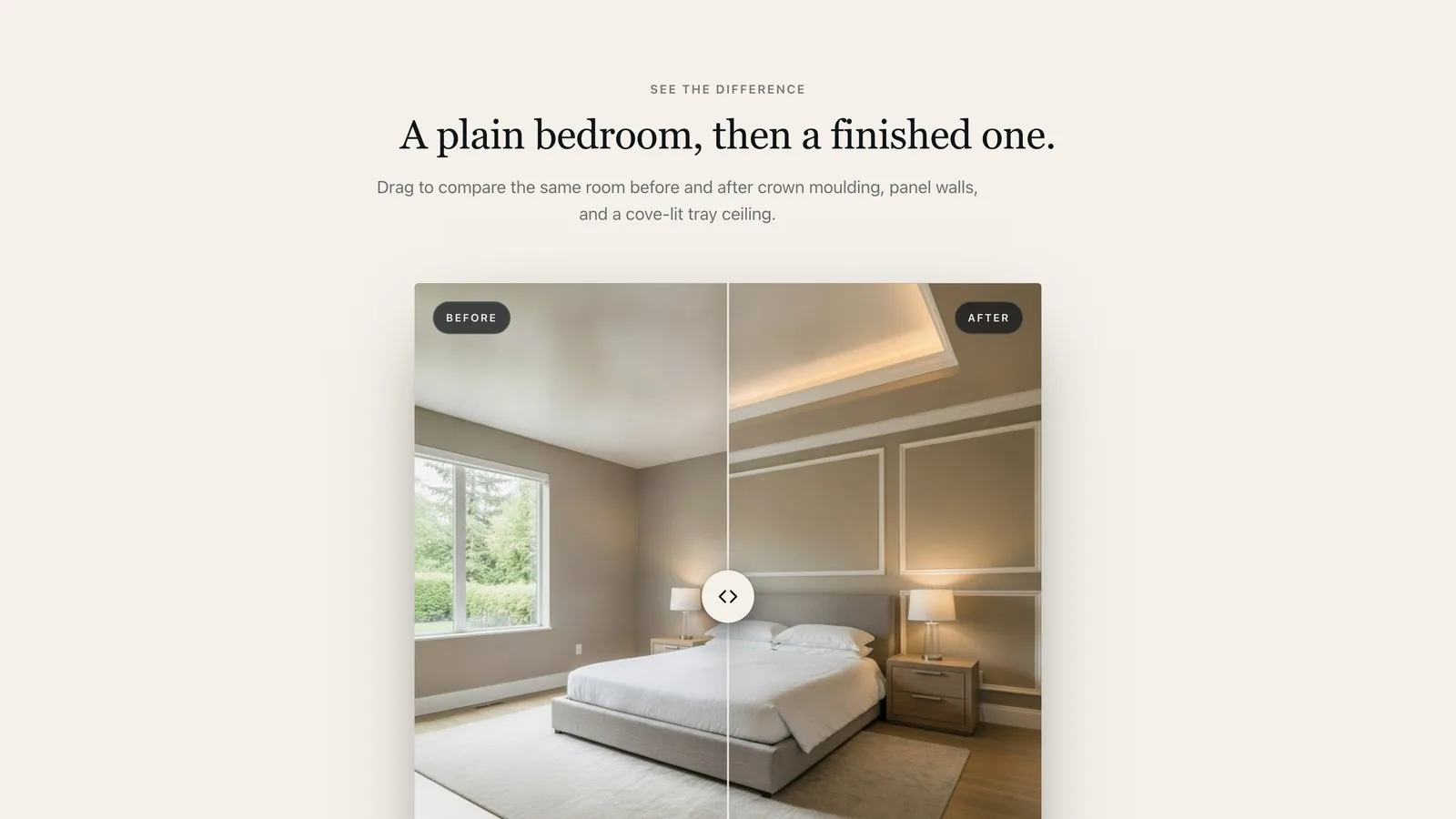
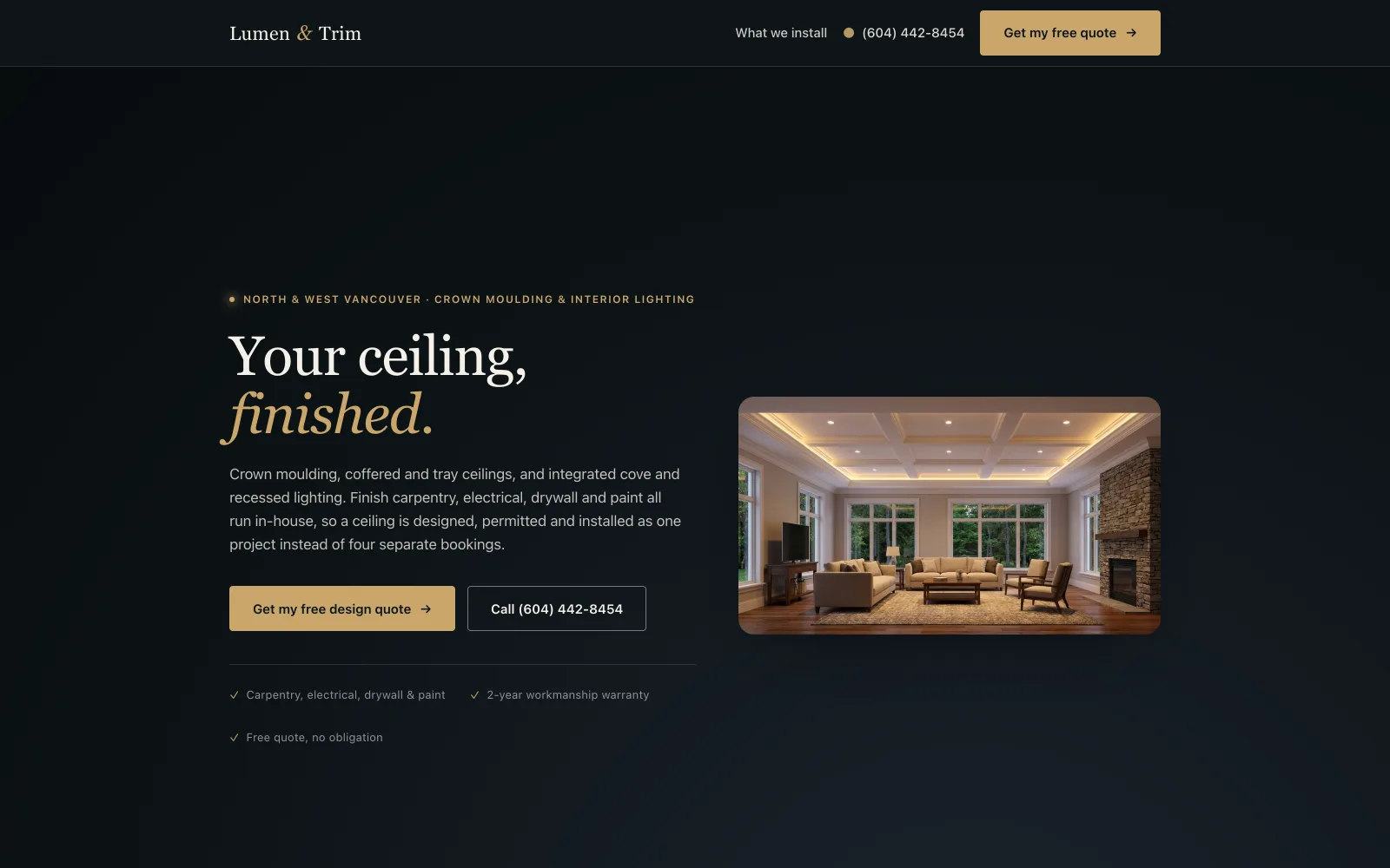
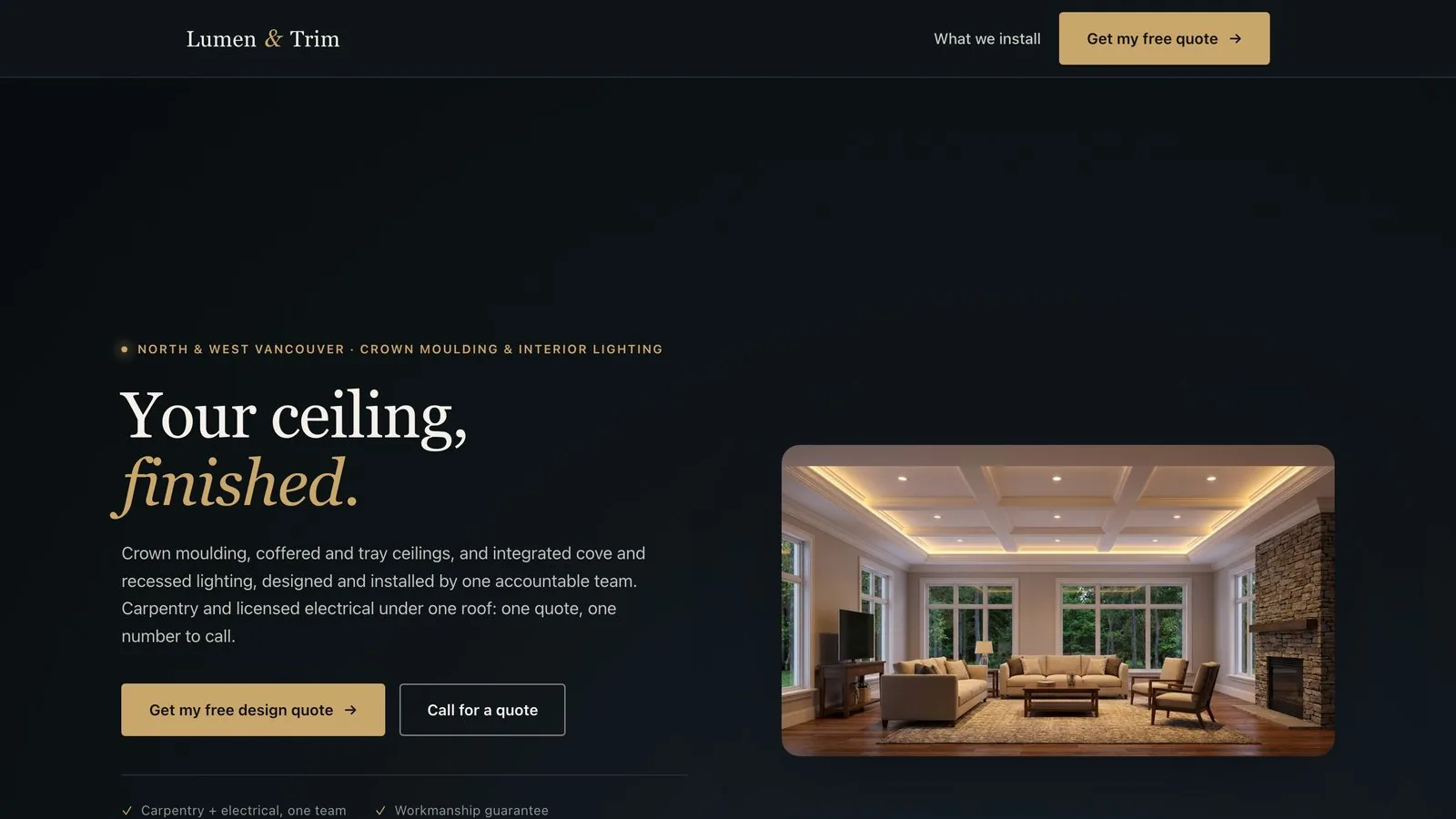
A finished-ceiling specialist for North and West Vancouver: crown moulding, coffered ceilings and integrated lighting. Brand, art direction, copy and a built website, designed around a single promise: your ceiling, finished. 5 pieces.
Status: designed, built and complete. The site is deployed but held out of search indexing, so it has no traffic and no performance data, and none is claimed here.
—
The design language
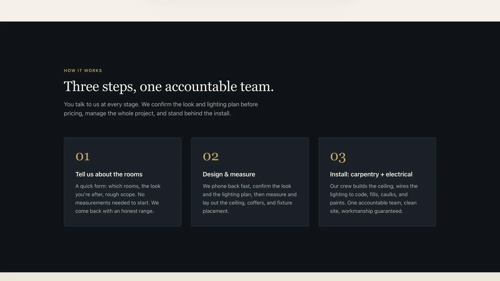
A finished ceiling photographs as light on plaster, so the page is built as a dark room with warm fixtures in it. Near-black ground, one warm metal accent, and a serif that carries the headline while everything functional stays in a plain sans. Photography does the selling; the type stays out of its way.
Palette
- Ink #0E1417 The page ground. Dark enough that a lit ceiling in a photograph reads as the light source.
- Ink deeper #080C0E The step below the ground, for the header and the deepest bands.
- Ink soft #1A2228 Raised cards and panels, one step up from the ground.
- Amber #C9A66B The one accent: buttons, the ampersand in the wordmark, every eyebrow. Warm metal, the colour of the fixtures being sold.
- Amber soft #E0C28F The lighter amber, for headline emphasis and hover states.
- Paper #F5F1EA Type on dark, and the ground of the light sections. Warm off-white, never pure.
- Slate #6B6F73 Secondary type: captions, fine print, the assurance list.
- Line #2A3138 Hairlines and card borders on the dark ground.
Typography
- Fraunces Display. Headlines only, with the emphasis word set in italic so a two-line headline has a turn in it.
- Inter Everything else. Body, navigation, buttons, the quote form, the specification lists.
- Hero headline clamp(2.25rem, 5.5vw, 4rem)
- Section head clamp(1.75rem, 3.2vw, 2.5rem)
- Eyebrow uppercase · wide tracking · amber
Guidelines
Do
- Let the photograph be the proof. A finished ceiling sells itself; the copy names what it is and gets out of the way.
- Keep the accent to one warm metal. It is the colour of the light being installed, so it belongs to the product.
- Put the phone number on every screen. This is a trade where people call rather than fill in a form.
- Say what is actually promised, in writing, where reviews would normally sit. The business is new and has none yet.
Don’t
- Never print a licence, insurance or trade-registration claim that has not been verified. Three of them were live on this site once and were removed the day they were checked.
- No review count, no star rating, no founding year. There is nothing to count yet, and inventing one is the fastest way to lose the customer who checks.
- No stock photograph presented as the company's own work.
- Never let the serif out of the headline. In body copy it slows a page that has to be read on a phone in a driveway.
01
Brand

02
Website
03
Art direction