VEDA9 founding client · 2026
Pemberton Ave Door & Window
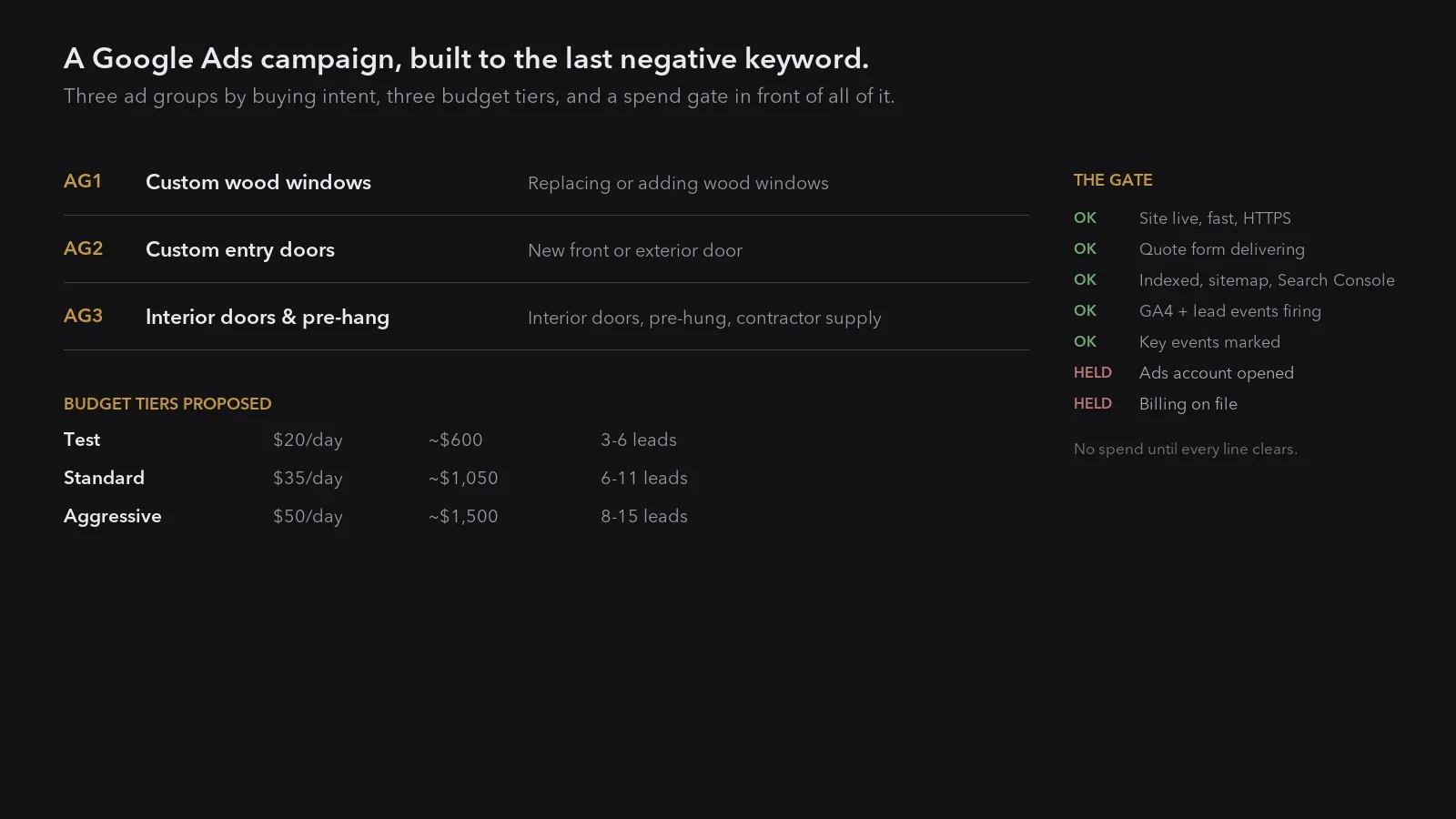
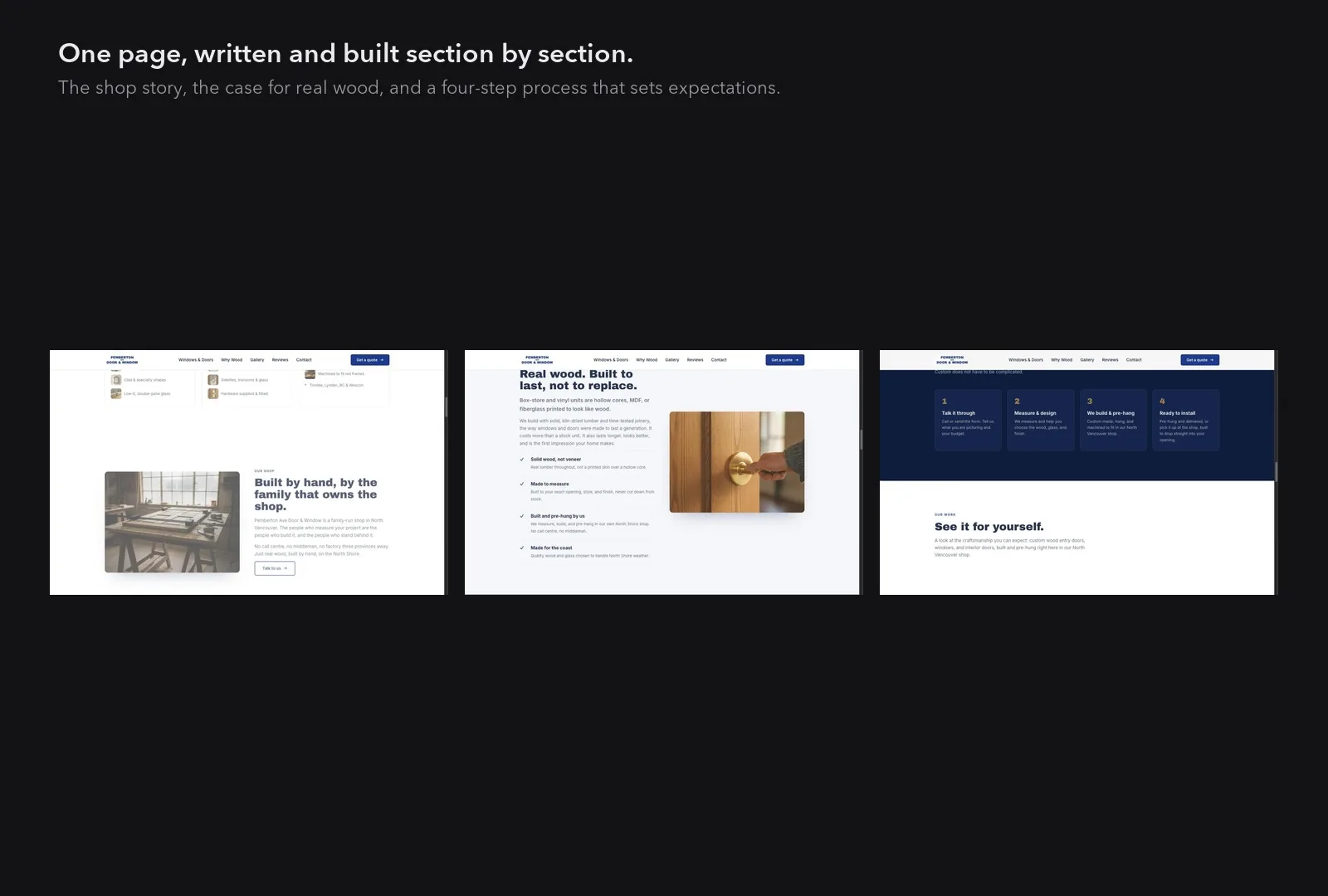
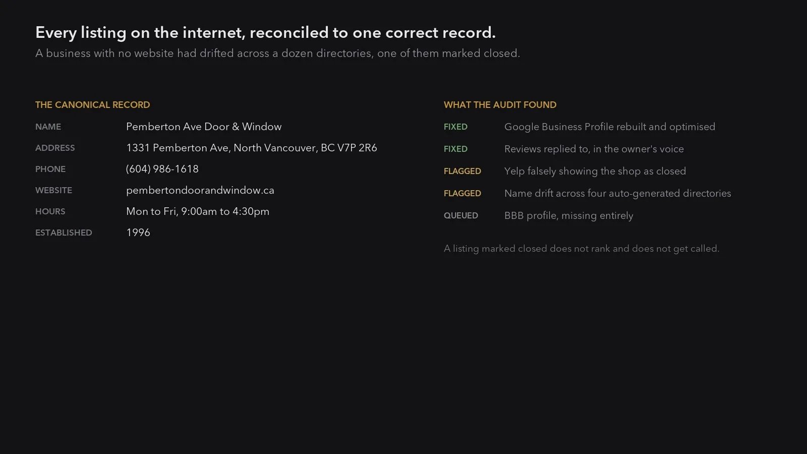
A family-run North Shore workshop with no website and no artwork of any kind. VEDA9 built the foundation end to end: an identity, a quote-focused website, a corrected local-search record, and a Google Ads campaign built to the last negative keyword. 5 pieces.
Status: built and ready to launch. The advertising campaign was completed and then deliberately held. No budget was set and no spend has run, so there are no performance figures on this page and none are claimed. Reporting begins when the campaign clears its tracking and budget gates.
The design language
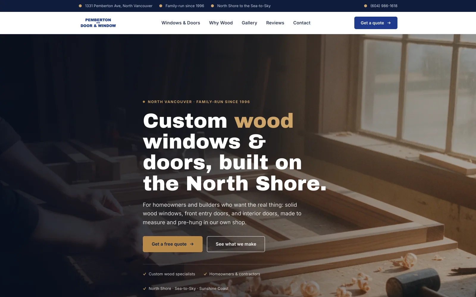
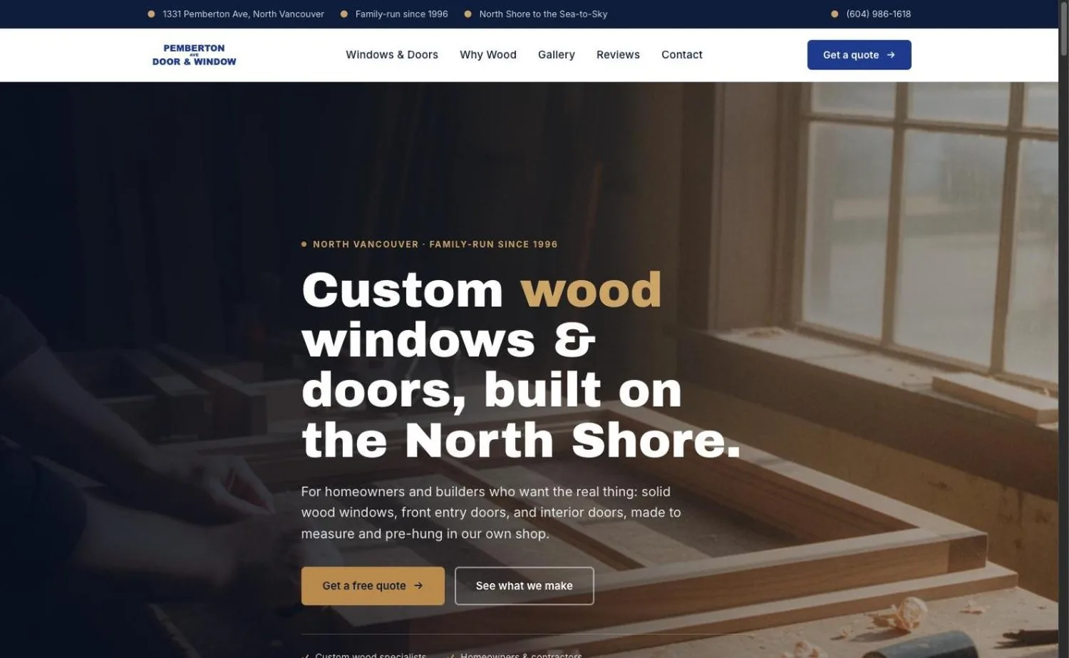
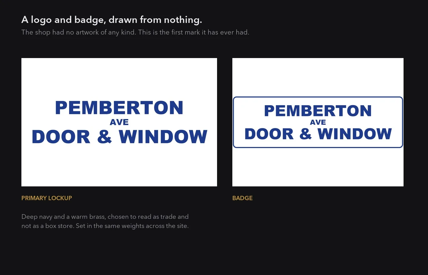
A thirty-year-old family joinery, so the page is built to look established rather than new. Navy and brass, a heavy display face set large, and full-bleed workshop photography of the actual shop. The structure is deliberately conventional: a bar of contact facts, a white navigation, then the work. Nothing here is trying to be clever, because the customer is checking whether these people are real.
Palette
- Navy #0F1D3D The contact bar and the deep grounds. The trade colour, and the one already on the client's own signage.
- Blue #1E3A8C The wordmark and the primary button. Brighter than the navy so an action reads as an action.
- Blue deep #16306F Pressed and hover states for the primary button.
- Brass #B98A4B The accent, and it is literal: door and window hardware is brass. Eyebrows, the emphasis word, the secondary button.
- Brass soft #CDA468 The lighter brass, for bullets and small marks on dark grounds.
- Ink #1F2937 Body type on light sections.
- Slate #5B6675 Captions and fine print.
- Surface #F4F6FA The light section ground, cool rather than cream, so it sits with the navy.
- White #FFFFFF The navigation bar, kept solid so the phone number and the quote button never sit on a photograph.
Typography
- Archivo Black Display. One weight, set very large. It reads as signage, which is the register a thirty-year-old shop earns.
- Inter Everything else. Body, navigation, contact bar, forms.
- Hero headline clamp(2.4rem, 5.4vw, 4.3rem)
- Section head clamp(2.1rem, 5.4vw, 3.9rem)
- Sub head clamp(1.7rem, 3.2vw, 2.6rem)
- Eyebrow uppercase · wide tracking · brass
Guidelines
Do
- Put the address, the phone number and the years in business at the very top. For a local trade those four facts are the whole first impression.
- Keep the navigation on solid white. A transparent bar over a photograph is where a phone number goes to be unreadable.
- Use the shop's own photography. The workshop is the product proof, and a stock joinery is worse than no photograph.
- Set the headline big enough to read as a sign. The display face is one weight and it is meant to carry.
Don’t
- No claim the client cannot back. The founding year is on their own signage; anything that is not gets left out.
- No review count or star rating printed as copy. Reviews live on the profile that owns them.
- Never put brass on a large surface. It is hardware, and hardware is a detail, not a wall.
- No second display weight. One weight set at different sizes is what makes it read as signage rather than a template.
Website
Brand
Local search
Paid media