Concept piece · 2026
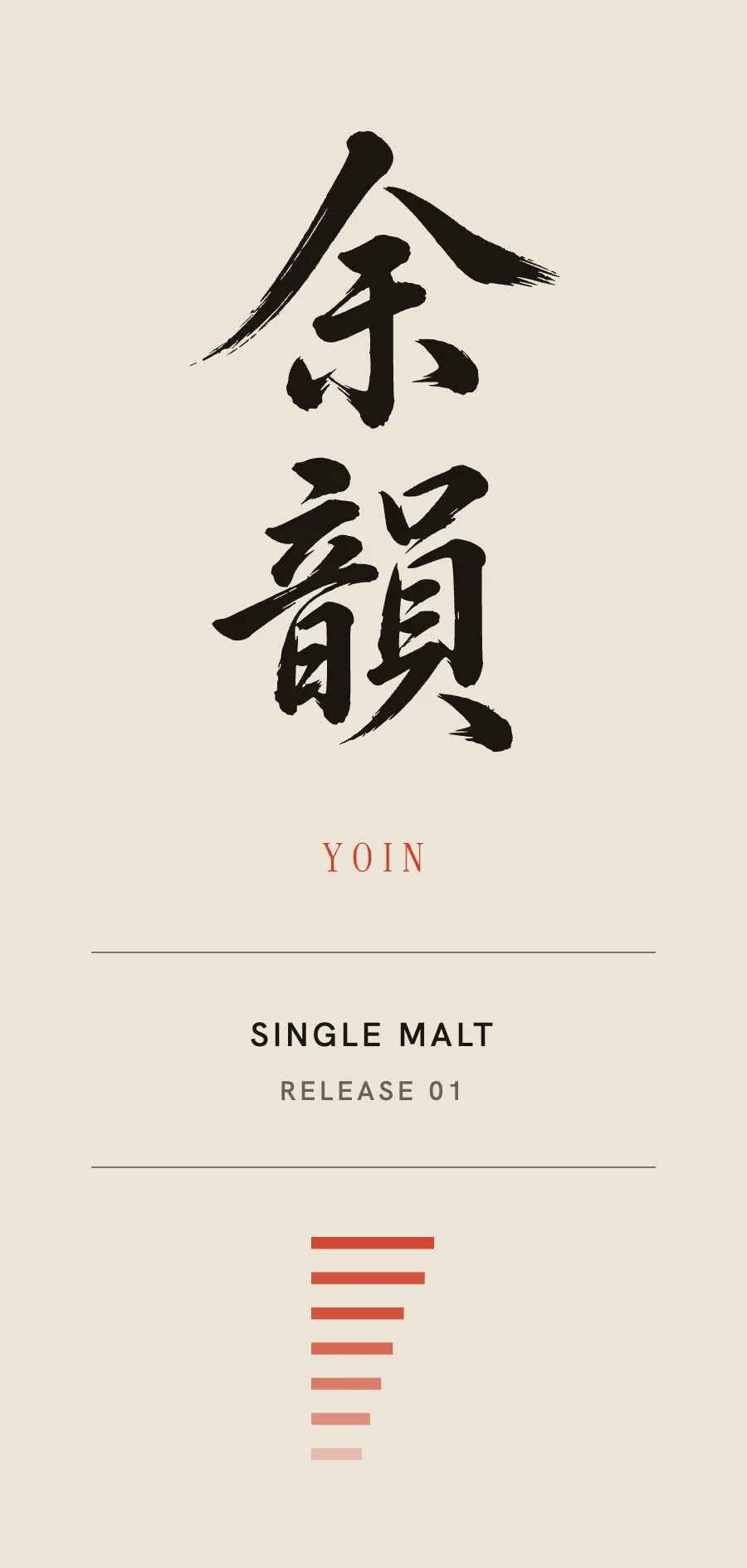
YOIN 余韻
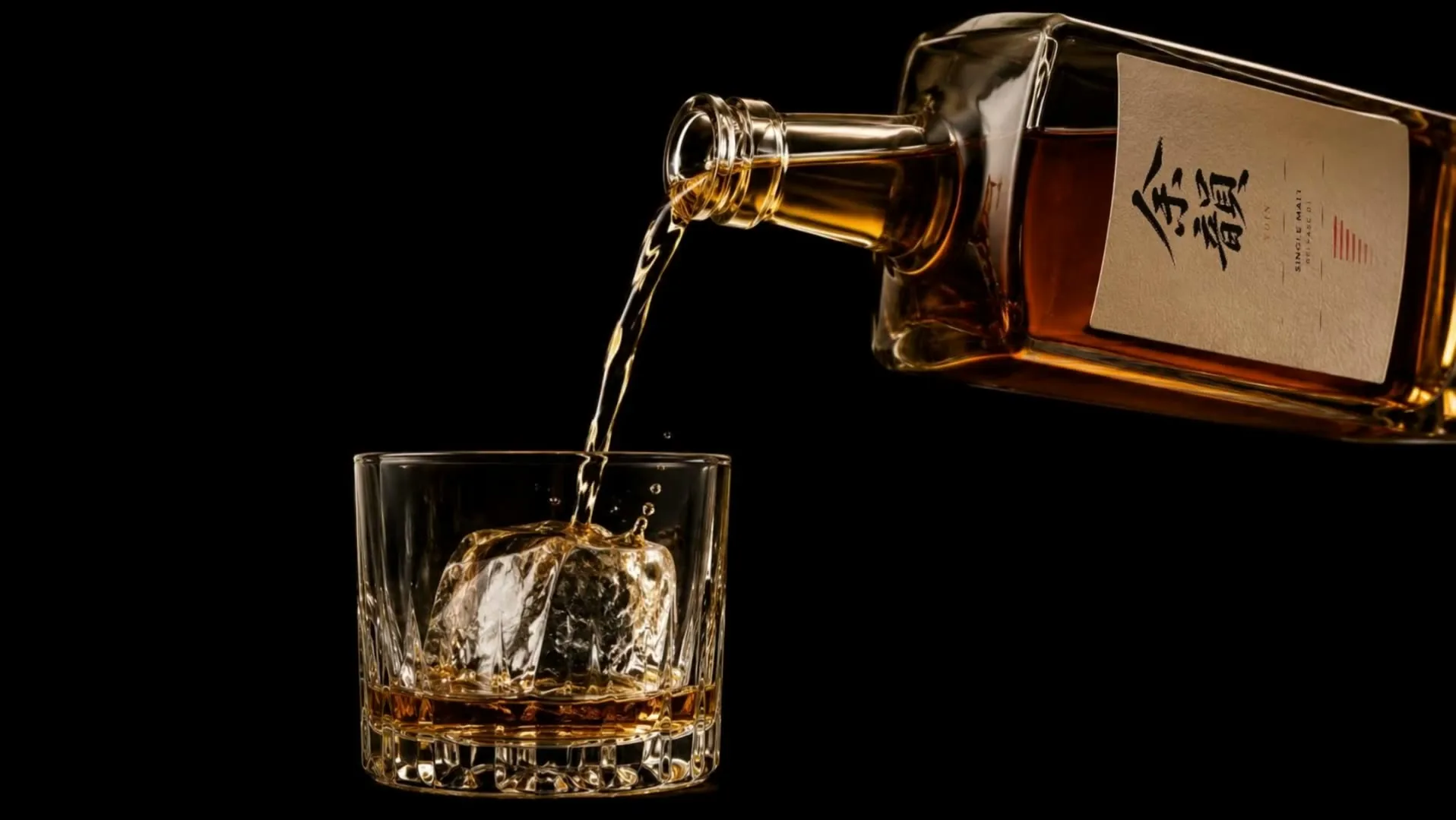
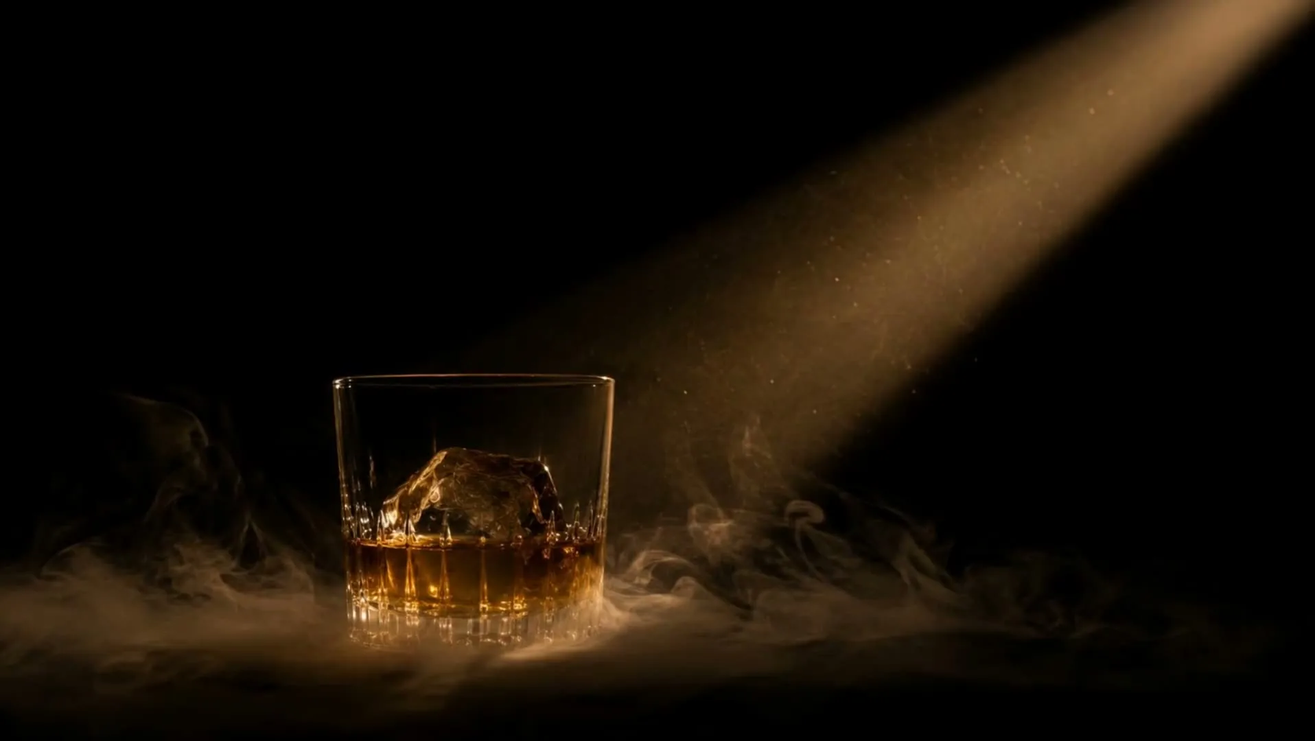
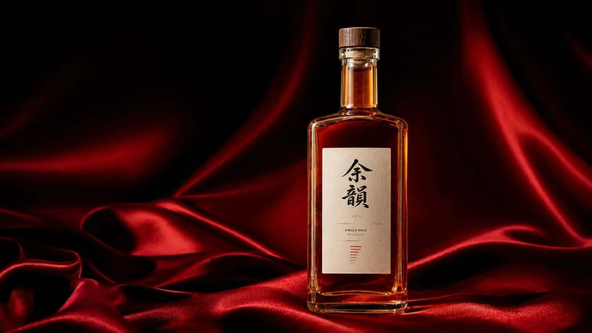
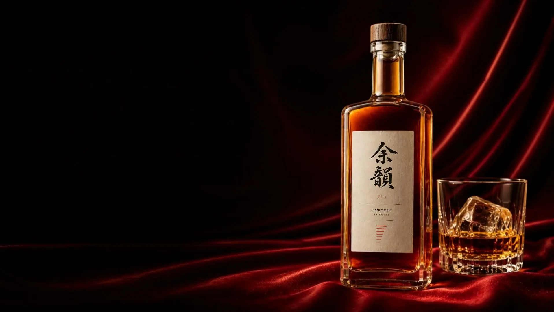
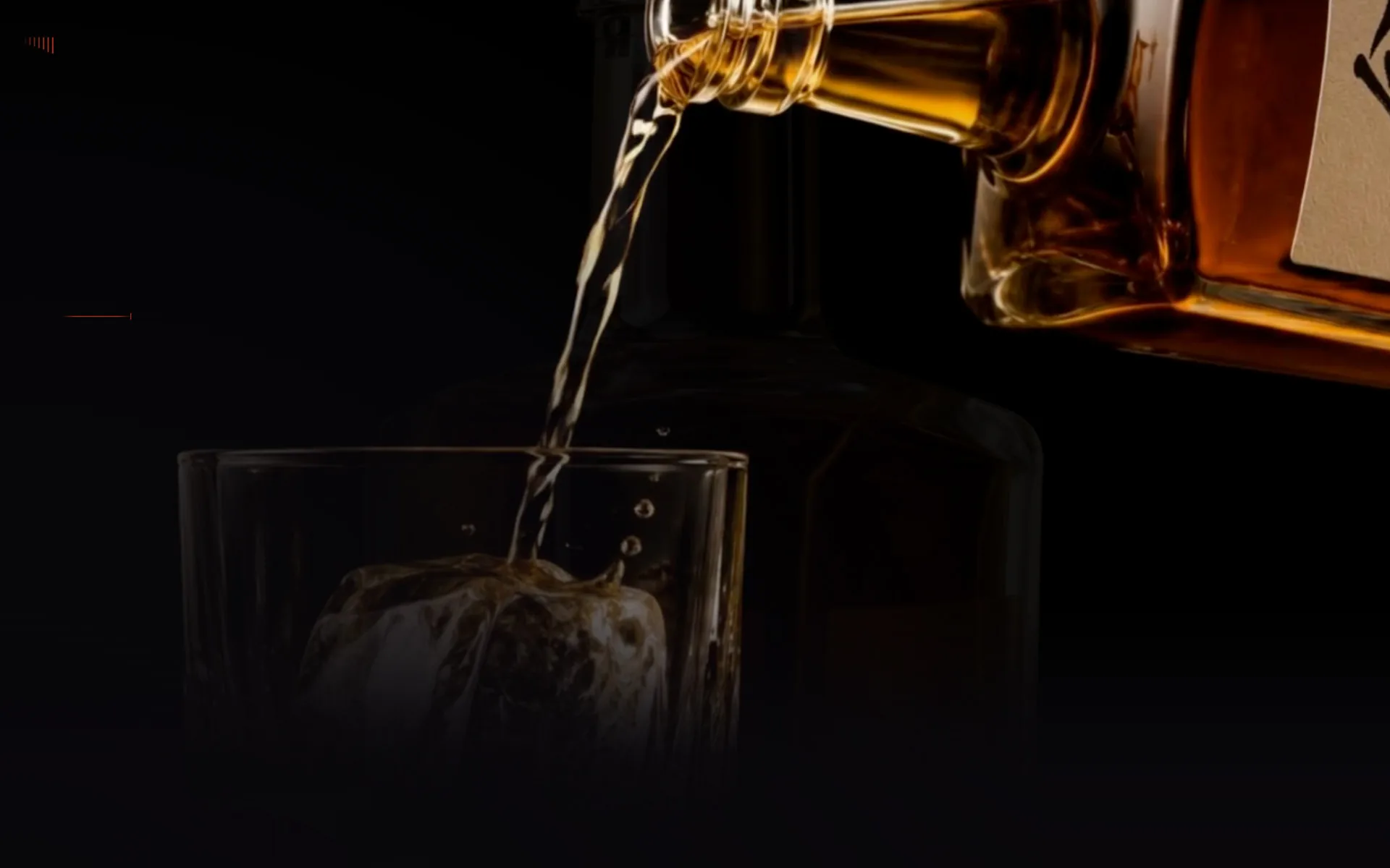
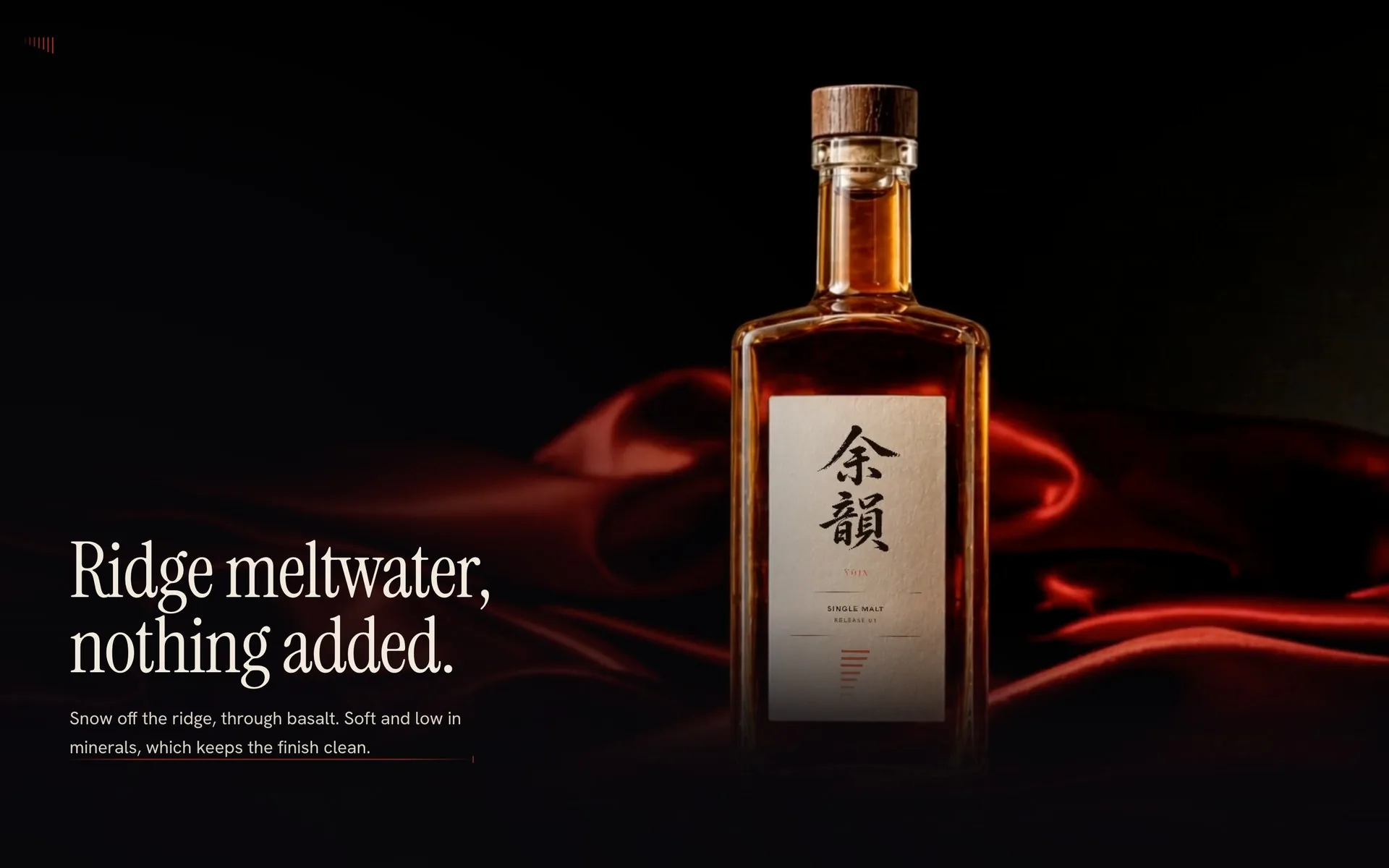
A fictional small-batch Japanese single malt, taken from the name to the finished page: naming, narrative, art direction, motion and build. Six clips of the same release sit on one fixed stage and are scrubbed by the scroll across a track 11.1 screen-heights deep, joined so the camera appears to flow between them, except at two authored breaks where the subject changes outright: the bottle leaving for the glass, and black becoming vermilion. One vermilion hairline runs down the left margin the whole way, growing from a tick to the width of the copy column, and it is the one thing that survives both.
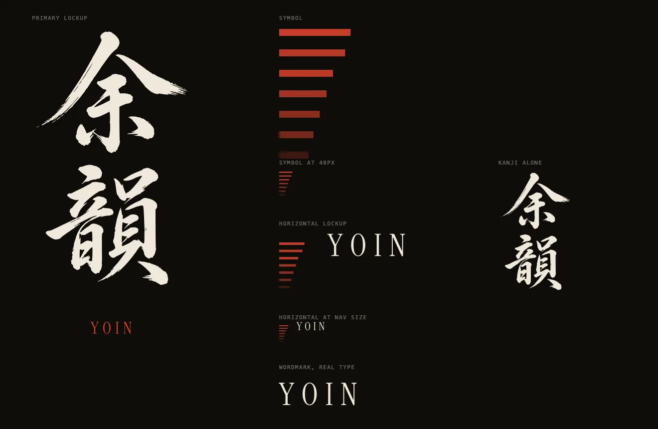
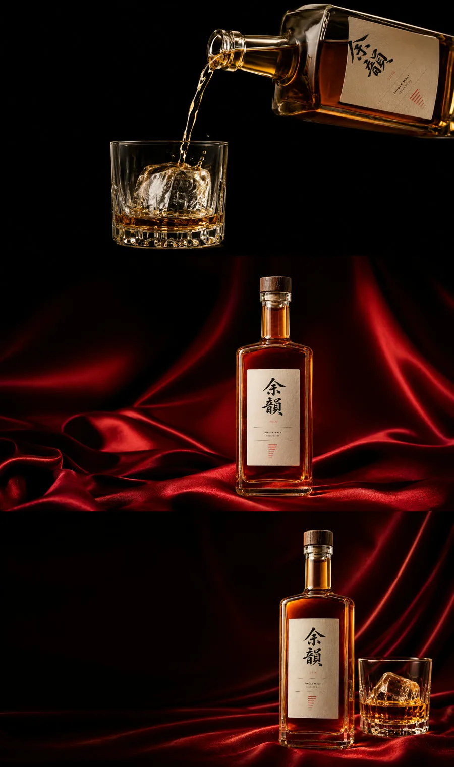
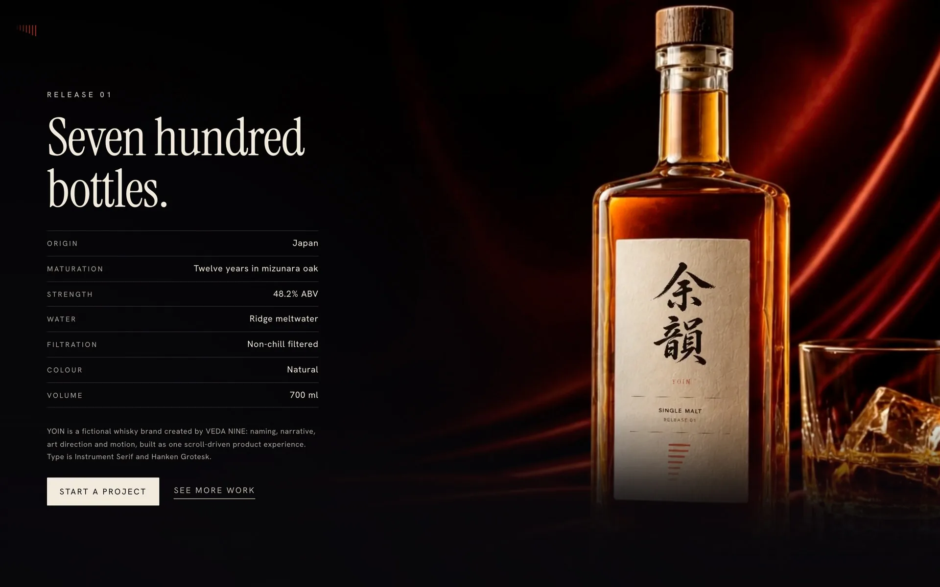
Concept work. YOIN is an invented brand, made for this piece: there is no distillery, no product and no client, and every fact printed inside the page belongs to a brand that does not exist. Nothing here was published or advertised, so no traffic, ranking or sales figure is claimed and none exists. The whisky photography is generated; the label is composited from the brand file so the mark is never redrawn.
The design language
A tabletop film, told as a page. Six clips scrub under the wheel against a near-black ground, and type is the only thing that ever sits still. The system is deliberately narrow: two typefaces, one accent, and a rule that nothing may occupy document flow, so the page carries no nav bar, no section chrome and no footer to compete with the film.
Palette
- Canvas #08070A The page ground. Near black, pulled a hair cool, so the amber in every clip reads warm against it.
- Surface #131017 The one step up from the ground, for the few panels that have to lift off it.
- Ink #F2EADD All type. Warm off-white, never pure white, so it belongs to the same light as the whisky.
- Ink soft #8B8079 Secondary type: specification labels and the colophon.
- Vermilion #C8321F The single accent, and it is borrowed from the film itself: the satin in the closing shots and the bars on the label.
- Border #2A2229 Hairlines and the specification rules. One step warmer than the ground.
Typography
- Instrument Serif Display. Every headline, set tight at -0.015em with line-height under 1, so a two-line statement reads as one block.
- Hanken Grotesk Everything else. Body, eyebrows, specification table, buttons.
- Noto Serif JP The 余韻 mark only. A Japanese face for the Japanese characters, not a Latin face approximating them.
- Display clamp(2.4rem, 6.4vw, 5rem) · line-height 0.98 · tracking -0.015em
- Display XL clamp(2.9rem, 8.2vw, 7rem) · line-height 0.94
- Lede clamp(1rem, 1.35vw, 1.16rem) · line-height 1.62
- Eyebrow 0.72rem · tracking 0.34em · uppercase
- Spec label 0.68rem · tracking 0.2em · uppercase
- Button 0.78rem · tracking 0.16em · uppercase
Guidelines
Do
- Keep the ground a hair cool. Every clip on the page is amber, and a warm ground would flatten it.
- Let one copy block sit inside one shot, so no line of type is ever half on one clip and half on the next.
- Spend the vermilion only where the film already spends it: the satin and the label bars.
- Keep chrome to one small fixed mark, rotated ninety degrees, so it cannot be mistaken for a menu.
- Scrub the film with the wheel. The scroll is the transport, and the reader sets the pace.
Don’t
- Never put anything in document flow except the spacer: no nav bar, no sections, no footer.
- No scroll cue and no section counter. A page that has to tell you to scroll has already failed.
- No pure white type and no pure black ground. Both break the light the photography is lit in.
- Never autoplay a clip. Film that runs on its own turns the page into a video player.
- No em dash anywhere visible, and no first person, size or tenure in any line that ships.
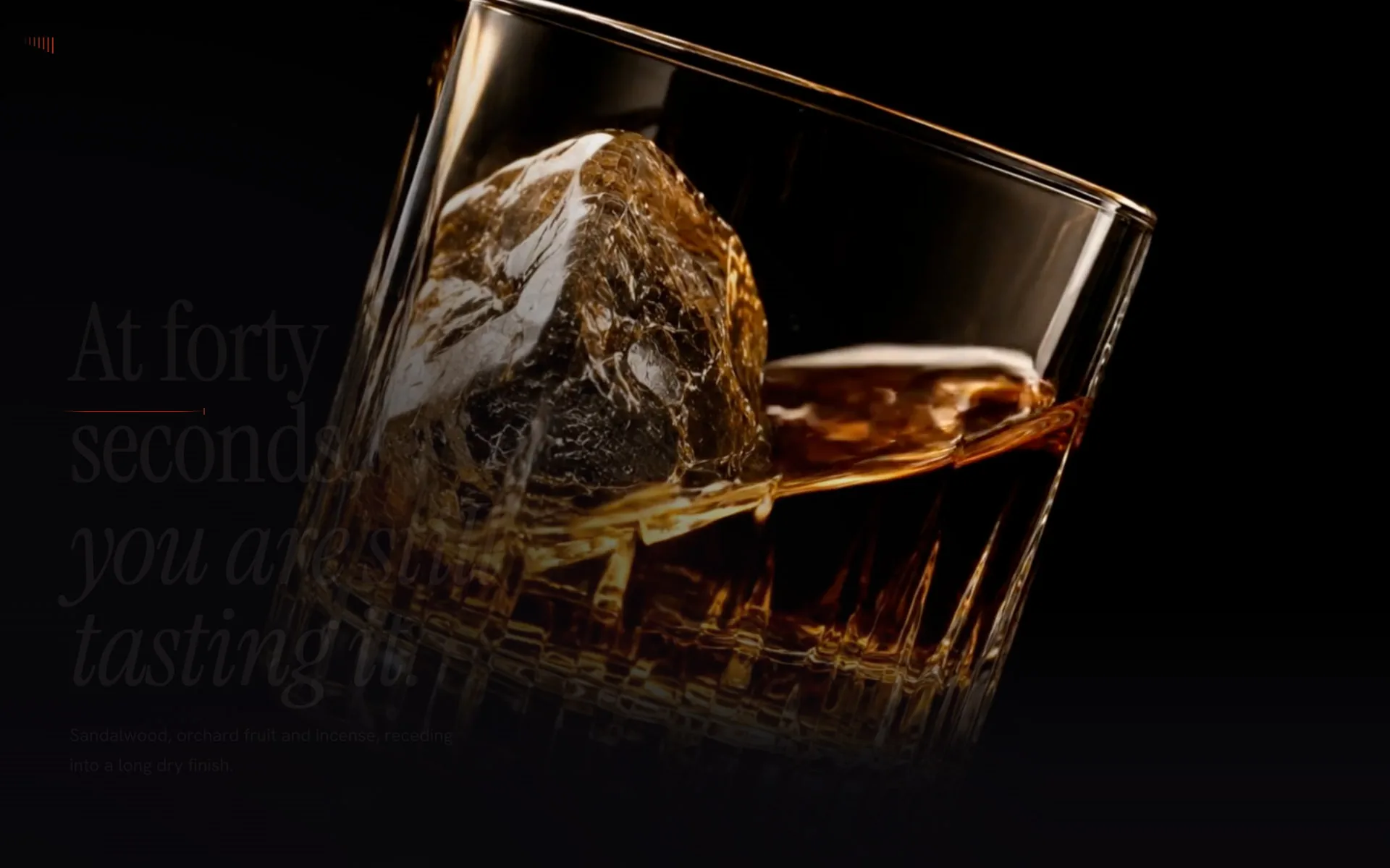
Leg 03, the swirl. 5.04 seconds, the strongest movement on the page. On the site it is scrubbed by the scroll rather than played.
The film, leg by leg
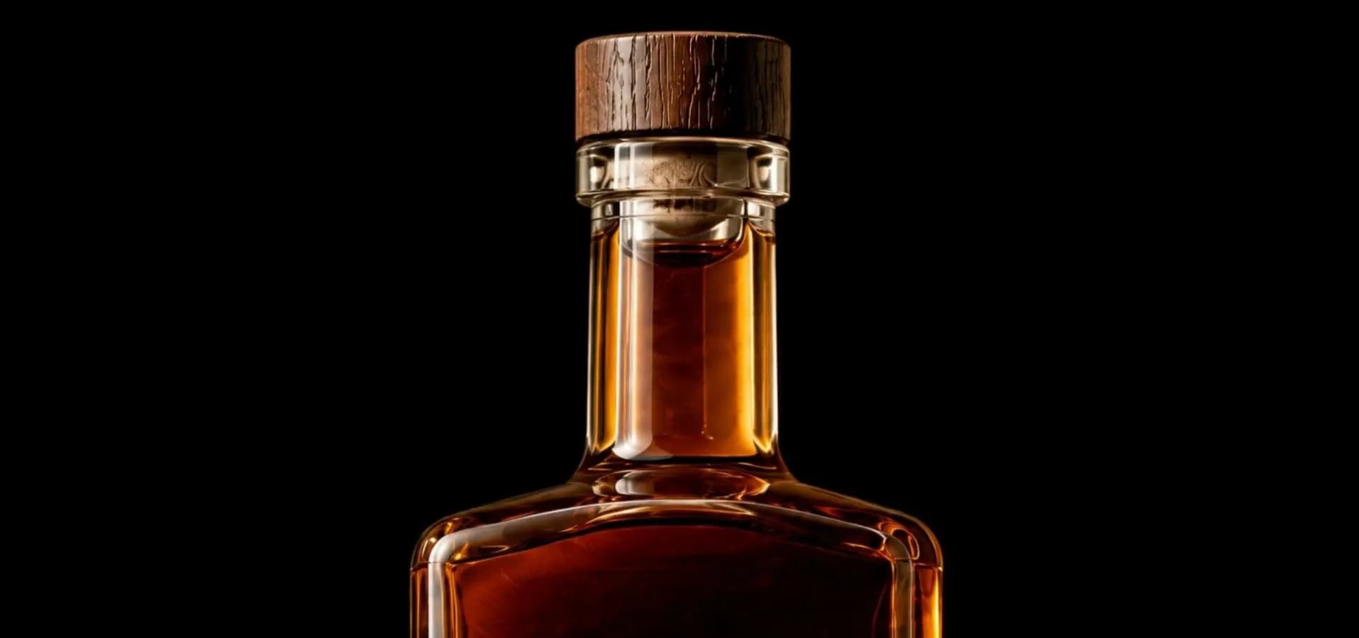

The page, as it scrolls

The mark, composited in code